Spring 2025 Update: We've recently launched Ably Chat, a new product that significantly simplifies building chat experiences on the Ably platform. Ably Chat comes with purpose-built APIs for realtime messaging, presence tracking, typing indicators, and reactions. Explore how you can build engaging chat experiences faster and easier. Learn more about Ably Chat →
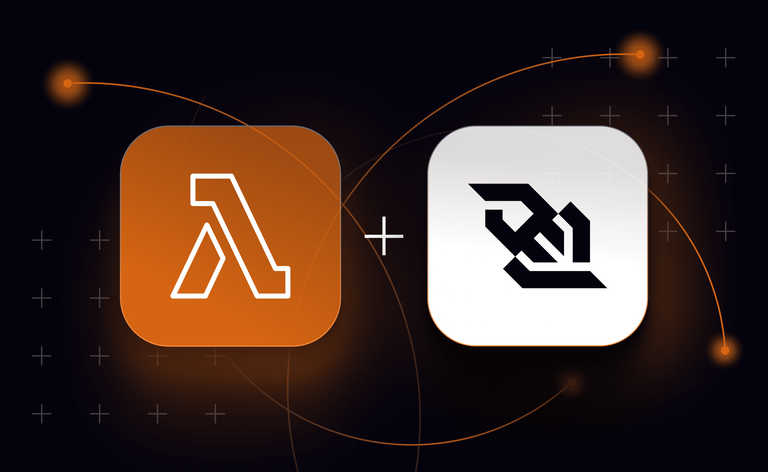
Web Components are a great way to build reusable functionality you can use in different web pages and web apps. Imagine sharing components between different frameworks like React, Vue.js, or Next.js! In this post, we delve into Web Components and show you how to build a chat web component with Ably to use it in an application built with AWS Amplify and AWS Lambda.
Web Components are a collection of web technologies, standardized in the browser, to ease writing reusable pieces of markup and functionality. They’re a combination of Custom Elements, the Shadow DOM and HTML templates. When they’re used all together, they’re collectively called Web Components. They are an alternative to framework-specific approaches to component reuse such as React Components, and Vue.js templates. What makes them interesting is they’re not bound to any runtime framework, and they’re supported by all modern browsers. Competing approaches to components for the web were established prior to Web Components being widely supported, which caused a lot of the frameworks to develop their own approaches to reuse and encapsulation. Web components offer a framework-independent way of building reusable functionality for the browser.
When talking about Web Components, most people refer to Custom HTML Elements, as these are the closest thing to the component models found in React or Vue. Custom Elements can:
- Render HTML into themselves by setting their own innerHTML properties.
- Encapsulate data by storing it as attributes on instances of themselves.
- Track changes to data stored in their attributes, and trigger a re-render.
- Allow you to write code that is triggered when they are added and removed from the DOM.
The first thing we’ll do in this post is create an example of a Custom Element that displays the number of times a button has been clicked. To create this Custom Element, we need to create a new JavaScript file that we can reference from our web page. Start by creating a new file called index.js. We’ll define a class for the Custom Element and call it CountComponent. This will extend HTMLElement (the browser's base type for all its elements):
classCountComponent extends HTMLElement {
}
Inside this class, we need to define the attributes to be observed for change tracking. For the sake of this demo, we will return an array of a single string - the attribute name count:
static get observedAttributes() {
  return ['count'];
}
Next, we need to define some custom attributes and their behaviour. We create a getter for the custom count attribute, and in the function, the attribute value count is loaded with a call to getAttribute, defaulting to the string "0". Once the data is loaded, we're parsing it from JSON - we do this because any data that we store must be a string.
get count() {
    const val = this.getAttribute('count') || "0"; return JSON.parse(val);
}
We also need to create a setter for our attribute, and here we’re serializing the value to JSON and setting it on our element:
set count(value) {
    this.setAttribute('count', JSON.stringify(value));
}
Even though Custom Elements are defined as classes, you can’t put any logic inside their constructors other than calling super to trigger the base logic for the HTML Element class. Add any other logic, or miss out calling super and you'll see an error in your console and the element won't work.
constructor() {
    super();
}
Because we can’t do any meaningful work in the constructor, Custom Elements provide lifecycle callbacks – functions that you can implement at different parts of the component lifecycle. We will use the
connectedCallback function. Implementing this callback will cause the code to run when the component is added to the DOM – it is similar to React's componentDidMount function. In connectedCallback, we're setting a default for the counter, and calling a function we'll look at shortly called setContent:
connectedCallback() {
    this.count = 0; this.setContent();
}
The next lifecycle callback function available to us is disconnectedCallback (shown here only for illustration purposes as we're not running any code). The code in this function executes when your element is removed from the DOM and destroyed.
disconnectedCallback() {
    // This is the web component version of react's "componentDidUnmount"
}
Custom Elements also provide us with an attributeChangedCallback. We will use this function to execute code whenever an observedAttribute changes:
attributeChangedCallback(attrName, oldValue, newValue) {
    // When an observed attribute changes this.setContent();
}

setContent() {
    this.innerHTML = `
        <div>Count is: ${this.count}</div>
        <button>Increment Counter</div>
    `;
    this.querySelector("button").addEventListener('click', () => {
        this.count++;
    });
}
setContent is a function that the component calls when the component is added to the DOM, and when an update happens. The click handler in the above code can access the attributes of the element using the this keyword, so on each click, we increment the value, in turn triggering a re-render. Note: This demo is not particularly performance focused, in that it sets the entire innerHTML and wires up a click handler to the button each time it's called. This is not how one would build an application for production! In a real application, you would not reset your entire DOM. Instead you would only change the parts of the UI that required updating. Furthermore, the Shadow DOM APIs could be used in more performance-sensitive scenarios.
Finally, at the end of the JavaScript file, we call the browser’s customElements.define API — providing a tag name for the element, and a reference to the class we just defined.
customElements.define('count-component', CountComponent);
It is now possible to reference the Custom Element JavaScript file as a module and add the element we just made to the page using the tag name that we defined:
<script src="component/CountComponent.js" type="module"></script>
<count-component></count-component>
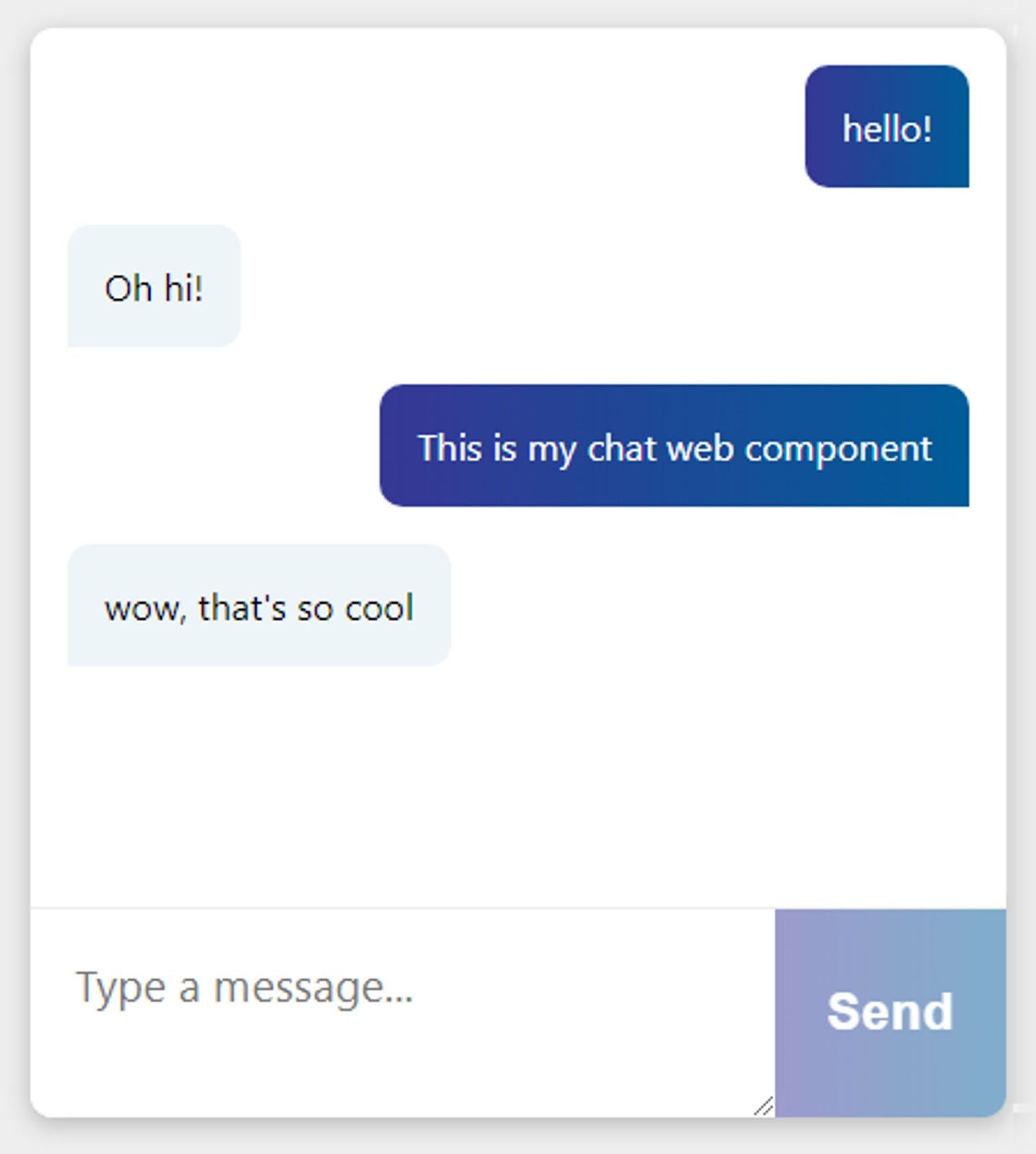
And the component renders thus

Building a Chat web component with Ably
We’re going to build a text chat component – Ably Chat component – by building two Custom Elements:
- AblyBaseComponent.js – a base component that encapsulates Ably interactions
- AblyChatComponent.js – an element that inherits from AblyBaseComponent and implements chat logic on top of Ably.
The base component is designed strictly to be built upon, and to encapsulate the basic requirements for Ably API key management and subscribing to channels. Using this base component, we could build any kind of Custom Element that relies on realtime messaging.
In order to connect to Ably, you need an Ably account and an API key.
Building the Base Component
The base component starts with the standard Custom Element boilerplate – AblyBaseComponent extends HTMLElement, and calls its constructor.
export default class AblyBaseComponent extends HTMLElement {
    constructor() {
        super();
    }
}
In the connectedCallback function, we call this.connectToAblyChannel (which we'll examine shortly):
connectedCallback() {
    this.connectToAblyChannel();
}
The disconnectedCallback function loops through this.subscribedChannels (which we will create in a connect function) and unsubscribes from any Ably channels that have been used:
disconnectedCallback() {
    this.subscribedChannels.forEach(ch => {
        ch.unsubscribe();
    });
}
The connectToAblyChannel function is where a lot of the real work happens. We start off by loading some configuration – we will set up a convention that we expect users to supply either their Ably API key, or a callback URL to an API that responds with an Ably token authentication request. To supply these values, and because we're creating HTML elements, we expect them to be set as attributes on the element when it's created in the markup.
In order to read the data attribute when the element is connected, we expect the element to look as follows:
<ably-component data-api-key="API_KEY_HERE" />
Next we need to design a way to configure the Ably client. In regular JavaScript you might use the Document API to interact with elements in the DOM – but because we’re literally inside the custom element, we can use DOM API calls like getAttribute from the this object.
connectToAblyChannel() {
    const ablyApiKey = this.getAttribute("data-api-key");
    const ablyTokenUrl = this.getAttribute("data-get-token-url");
    const ablyConfig = ablyApiKey ? ablyApiKey : { authUrl: ablyTokenUrl };
}
This code tries to load data-api-key and data-get-token-url. If an API key is found, it takes precedence, otherwise, we create an Ably JavaScript SDK configuration object that contains an "authUrl" property. Now that we have a configuration object (either an API key or a URL), we can create an instance of the Ably Realtime JavaScript SDK. It is important to point out that this Custom Element relies on the containing page having already included the Ably JavaScript SDK using a script element before it is executed. The following code comes after the configuration, inside the connectToAblyChannel function:
this.ably = new Ably.Realtime(ablyConfig); this.subscribedChannels = [];
Once we have the SDK instance, stored in the variable this.ably, we will also create an empty array called
subscribedChannels.
We’re going to conclude with two additional functions in the AblyBaseComponent – a publish function and a
subscribe function.
The regular Ably SDK exposes publish and subscribe functions once you have called
ably.channels.get(channelName) to get a channel. For this chat example, we want to let the AblyChatComponent decide which channels it will publish and subscribe on, effectively extending the API surface area of the Ably SDK (the set of things the API can do).
The augmented publish and subscribe functions take an extra parameter at the start – the channel name – then pass on the rest of the arguments to the Ably SDK to do all the hard work for us. We do this by destructuring the arguments array, and ignoring the first element. This allows us to capture all of the parameters, except the first one, in our newly defined variable args:
publish(channelName, ...publishArguments) {
    const [ ignored, ...args ] = arguments; // destructure the arguments array
    const channel = this.ably.channels.get(channelName);
    channel.publish.apply(channel, args);

    if (!this.subscribedChannels.includes(channel)) {
        this.subscribedChannels.push(channel);
    }
}
We can then use .apply on the publish or subscribe calls from the Ably SDK to pass the rest of the variables to the SDK to publish or subscribe to messages.
We will use the first parameter, the channelName, to get the correct channel and keep track of it so we can unsubscribe when we unmount from the DOM. The following code will go inside the publish function, below the arguments assignment. The subscribe function works similarly
subscribe(channelName, ...subscriptionArguments) {
    const [ ignored, ...args ] = arguments;
    const channel = this.ably.channels.get(channelName);
    channel.subscribe.apply(channel, args);
    if (!this.subscribedChannels.includes(channel)) {
        this.subscribedChannels.push(channel);
    }
}
As you can see, both publish and subscribe are virtually identical functions - with the exception that we're passing to them the call to channel.publish or channel.subscribe, respectively.
This all might seem a little framework-like, but what it means is that developers building Ably components on top of this base class can call publish or subscribe with an extra channelName parameter at the start of the call, and not worry about connecting or disconnecting from Ably channels.
This base class contains all our Ably code, and is now ready for us to build exciting components on top of it, so let’s create our second component, the AblyChatComponent.

Building the Chat Component
These components are designed to be imported as an ES6 Module – where the script tag you use in your HTML has type="module"as an attribute. When using ES6 modules, we can use import in browser components, so to start here, we're importing our AblyBaseComponent in order to extend it.
import AblyBaseComponent from "./AblyBaseComponent";
The next thing to do is set up some boilerplate code for the element. Define an attribute called “messages”, and set it up to be observable. Next, set up constructor, which in turn calls the constructor of the AblyBaseComponent using a call to super();.
class AblyChat extends AblyBaseComponent {
    static get observedAttributes() {
        return ['messages'];
    }

    get messages() {
        const val = this.getAttribute('messages') || "[]"; return JSON.parse(val);
    }

    set messages(messages) {
        this.setAttribute('messages', JSON.stringify(messages));
    }

    constructor() {
        super();
    }
}
We can use connectedCallback to configure the chat application. We call super.connectedCallback to trigger all of the Ably configuration logic from the base component. The following code goes below constructor, inside the closing bracket of the AblyChat class:
   connectedCallback() { super.connectedCallback();

 super.subscribe('chat', 'chat-message', (message) => { this.onAblyMessageReceived(message); });
We call the super.subscribe function that was defined on the base to subscribe to messages on a channel called chat. The rest of the parameters, as we pointed out earlier, are standard Ably JavaScript SDK parameters – we're subscribing only to messages on the topic chat-message. When a message is received, we call a function called this.onAblyMessageReceived (which we'll implement in a moment), passing the received message as an argument.
In order to ensure that any CSS styles applied to the page don’t affect the component, and vice versa, inside the body of connectedCallback, we will generate a random string and assign it to a property called id:
this.id = uuidv4();
Next we call a function named renderTemplateAndRegisterClickHandlers, which we'll look at shortly.
this.renderTemplateAndRegisterClickHandlers();
Finally, we place the browser focus on an element called this.inputBox that is generated when the template is rendered, so that people using the chat UI will be able to instantly start typing.
this.inputBox.focus();
We use the attributeChangedCallback to update the innerHTML of the chat bubbles in the chat window when messages are received. When an attribute is changed, the innerHTML of this.chatText is set and scrolled into view. We're using a function called formatMessages, which takes the message history, and converts it to HTML elements fit for display:
attributeChangedCallback(attrName, oldValue, newValue) {
    if (oldValue != newValue) {
        // Only update the chatText contents
        // Don't wastefully re-render the entire template
        // or re-register all the click handlers.
        this.chatText.innerHTML = this.formatMessages(this.messages);
        this.messageEnd.scrollIntoView();
    }
}
Next we set up the renderTemplateAndRegisterClickHandlers function, which is named for what it does! The start of this function calls another function called defaultMarkup, that takes a single parameter – the id of the element, and returns the innerHTML that we want to display on the screen - an empty chat box element.
Once the element has been rendered into the DOM, we can use querySelectorAll to find the chatText, inputBox, sendButton, and messageEnd elements so that we can use them in our code:
renderTemplateAndRegisterClickHandlers() {
    this.innerHTML = defaultMarkup(this.id);
    this.chatText = this.querySelectorAll(".chatText")[0];
    this.inputBox = this.querySelectorAll(".textarea")[0];
    this.sendButton = this.querySelectorAll(".button")[0];
    this.messageEnd = this.querySelectorAll(".messageEnd")[0];
}
Inside we also wire up the eventListeners for clicks on the sendButton and on each keyPress in the input box so that we can process user input.
this.sendButton.addEventListener('click', (event) => {
    this.sendChatMessage(this.inputBox.value);
});

this.inputBox.addEventListener('keypress', (event) => {
    this.handleKeyPress(event);
});
We mentioned the onAblyMessageReceived function earlier when we subscribed to Ably messages – this function takes the current message history from this.messages, makes sure it is at most 199 messages long, and adds the latest message to the end of the array:
onAblyMessageReceived(message) {
    const history = this.messages.slice(-199);
    const updatedMessages = [...history, message];
    this.messages = updatedMessages;
}
This new array is then assigned to this.messages, which triggers the UI to re-render because this.messages is an observed property.
The sendChatMessage function is called either when Enter is pressed, or when the button to send a message is clicked. Because we're extending the AblyBaseComponent, it calls the super.publish function, passing the channel name and the Ably message payload:
sendChatMessage(messageText) {
    super.publish("chat", { name: "chat-message", data: messageText });
    this.inputBox.value = "";
    this.inputBox.focus();
}
You can see that it’s also responsible for clearing the text box and focusing on it so the user can continue chatting.
The handleKeyPress function is triggered on each keypress. If the keypress is the Enter key and there is a message in the chat box, it sends the chat message:
handleKeyPress(event) {
    const messageText = this.inputBox.value;
    const messageTextIsEmpty = messageText.trim().length === 0;
    if (event.key === "Enter" && !messageTextIsEmpty) {
        this.sendChatMessage(messageText); event.preventDefault();
    }
}
The formatMessages function is responsible for mapping the Ably message history into span elements. There's a little bit of logic here to detect whether or not the message was sent by the current user of the app by checking the message.connectionId property against the ably.connection.id property, and adding a me or other CSS class that can apply styles to. The data property from the message is used to carry the received text message.
formatMessages(messages) {
    const messageMarkup = messages.map((message, index) => {
        const author = message.connectionId === this.ably.connection.id ? "me" : "other";
        return `<span class="message" data-author=${author}>${message.data}</span>`;
    });

    return messageMarkup.join("\n");
}
The above concludes the custom element class. After the custom element class ends, we have two functions. The first is the uuidv4() function – which generates a unique id for the component:
function uuidv4() {
    return "comp-" + 'xxxxxxxx-xxxx-4xxx-yxxx-xxxxxxxxxxxx'.replace(/[xy]/g, function(c) {
        var r = Math.random() * 16 | 0, v = c == 'x' ? r : (r & 0x3 | 0x8); return v.toString(16);
    });
}
The second is defaultMarkup which takes a single parameter – the ID of the component – and uses it to set the id property on the generated HTML.
Once we’ve set this id property, we can embed CSS that is scoped specifically to this element ID directly into the output code. This means that if multiple instances of the custom element appear on the same page, they won't have conflicting ids or styles.
At the bottom of this next snippet you can see the markup for the component – a div for holding message history, and a form for capturing user input, complete with the class names used in our query selector calls earlier.
customElements.define('ably-chat', AblyChat)
And of course, much like our example element at the start, we’re calling customElements.define to register the HTML tag:
<ably-chat></ably-chat>
The custom element is now functionally complete, and so long as both the AblyBaseComponent.js and AblyChatComponent.js files are included in a web application, they can be used by referencing our AblyChatComponent.js as a module.
<script src="component/AblyChatComponent.js" type="module"></script>
const defaultMarkup = (id) => (
    `<div id="${id}">
        <chat>
            <style>
                #${id}.chatHolder {
                    display: grid;
                    grid-template-rows: 1fr 100px;
                    background-color: white;
                }

                #${id}.chatText {
                    display: flex;
                    flex-direction: column;
                    align-items: flex-start;
                    gap: 1em;
                    height: calc(100vh – 40px – 100px – 100px – 100px);
                    padding: 1em;
                    overflow-y: auto;
                }

                #${id}.form {
                    display: grid;
                    grid-template-columns: 1fr 100px;
                    border-top: 1px solid #eee;
                }

                #${id}.textarea {
                    padding: 1em;
                    border: 0;
                    font-family: Arial, Helvetica, sans-serif;
                    font-size: 1.2em;
                }

                #${id}.button {
                    border: 0;
                    font-weight: bold;
                    font-size: 1.4em;
                    color: white;
                    background: linear-gradient(to right, #363795, #005C97);
                }

                #${id}.button:hover {
                    background: linear-gradient(90deg, rgba(54, 55, 149, 1) 0%, rgba(0, 92, 151, 1) 62%, rgba(0, 125, 205, 1) 100%);
                }

                #${id}.button:disabled,
                #${id}.button:hover:disabled {
                    background: linear-gradient(to right, #363795, #005C97);
                    opacity: 0.5;
                }

                #${id}.message {
                    flex-grow: 0;
                    padding: 1em;
                    border-radius: 10px;
                    border-bottom-left-radius: 0;
                    background-color: #eef5f8;
                }
            </style>

            <div class="chatHolder">
                <div class="chatText">
                    <div class="messageEnd"></div>
                </div>
                <div class="form">
                    <textarea class="textarea"></textarea>
                    <button class="button">Send</button>
                </div>
            </div>
        </chat>
    </div>`
);
To use the now-registered custom element, we use it like any old HTML tag and provide it with the correct attributes:
<ably-chat
    data-api-key="you-can-put-your-key-here-but-please-don't"
    data-get-token-url="https://your-token-request-url/createTokenRequest"
></ably-chat>
<!-- You only need one or the other of these attributes --->
The element renders like this in the page, and when configured with an API key or get-token-url, it just works!
API Key Management
As hinted above, we need to talk about API key management. While this custom element supports reading Ably API keys straight from your markup – which is great for local development and debugging – you absolutely should not store your Ably API keys in your markup, otherwise they could get stolen and misused.
The recommended way to use API keys in the front-end is to use Ably Token Authentication. Token authentication is an exchange mechanism where you use your real API key to generate limited-use tokens that can be passed back to your clients to use in the front end.
In order to use token authentication in this way, we need to create an API somewhere, to call from the front-end, that has your real Ably API key stored in it. We can then use a function in the Ably SDK to exchange your real API key for a token that gets returned to the Ably JavaScript SDK. The Ably JavaScript SDK manages this token exchange process for you. When you provide a URL that points to an API that will return a token, the SDK will manage and refresh the token as required, so you don’t need to worry about it. This demo will walk through using AWS Lambda functions and the AWS API Gateway to achieve this.
The following example AWS Lambda function provides the necessary token exchange functionality. All we need to do is require the Ably JavaScript SDK, and create an instance of the Ably.Realtime client passing your Ably API key from process.env.ABLY_API_KEY.
const Ably = require('ably/promises');
exports.handler = async (event, context) => {
    const client = new Ably.Realtime(process.env.ABLY_API_KEY);
    const tokenRequestData = await client.auth.createTokenRequest({ clientId: 'aws-client' });
    const statusCode = '200';
    const headers = { 'Content-Type': 'application/json' };
    const body = JSON.stringify(tokenRequestData);
    return { statusCode, body, headers };
};
We use client.auth.createTokenRequest to generate a temporary token, and return it back to the client.
The onus is on the owner of the API key to make sure that the users requesting a temporary token have access to chat – you can authenticate the requests any way you’d like, and it’s no different from authentication in any other lambda function. In the next section, we go through hosting this on AWS Lambda
Using AWS Lambda for Authentication
To deploy to AWS Lambda, we need to create a new directory called /api/createTokenRequest with two files in it — package.json and index.js Here’s the package.json file:
{
    "name": "createtokenrequest",
    "version": "1.0.0",
    "description": "",
    "main": "index.js",
    "scripts": {
        "test": "echo \"Error: no test specified\" && exit 1"
    },
    "author": "",
    "license": "ISC",
    "dependencies": {
        "ably": "^1.2.9"
    }
}
And this is the index.js file
const Ably = require('ably/promises');
exports.handler = async (event, context) => {
    const client = new Ably.Realtime(process.env.ABLY_API_KEY);
    const tokenRequestData = await client.auth.createTokenRequest({ clientId: 'aws-client' });
    const statusCode = '200';
    const headers = { 'Content-Type': 'application/json' };
    const body = JSON.stringify(tokenRequestData);
    return { statusCode, body, headers };
};
These two files, along with their node_modules are required by the AWS Lambda runtime. We’re going to use npm to restore the node modules and then compress the contents of the /createTokenRequest directory into a zip file. In the terminal execute the following:
    cd api/createTokenRequest
    npm install
After that, zip up the contents of the createTokenRequest directory (this process is OS dependent). We will use the AWS UI to create a Lambda function and upload this zip file as the source code.
We’ll walk through this process now. You need to log in to your AWS account first:
-
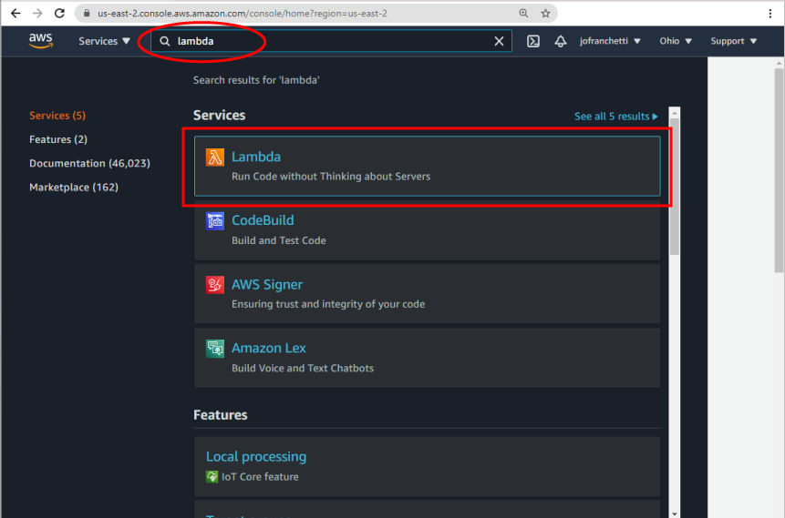
Search for lambda in the Services search bar, and click the Lambda services box that shows up in the results:
-
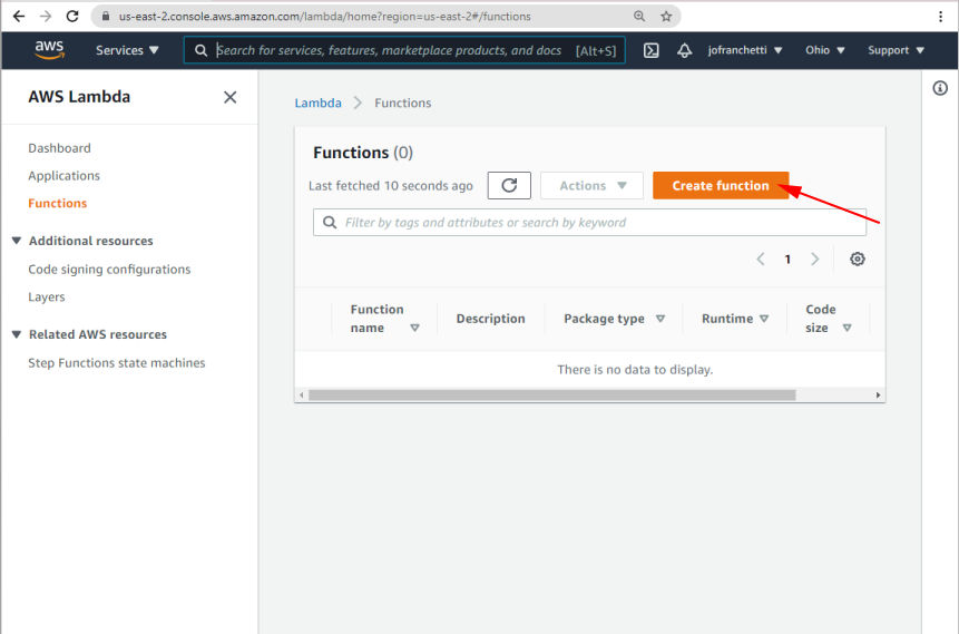
Click the “Create function” button to create a new Lambda function
-
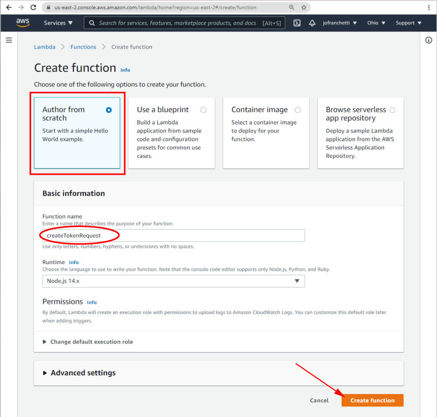
Select "Author from scratch" and give your function a name, then click "Create function":
-
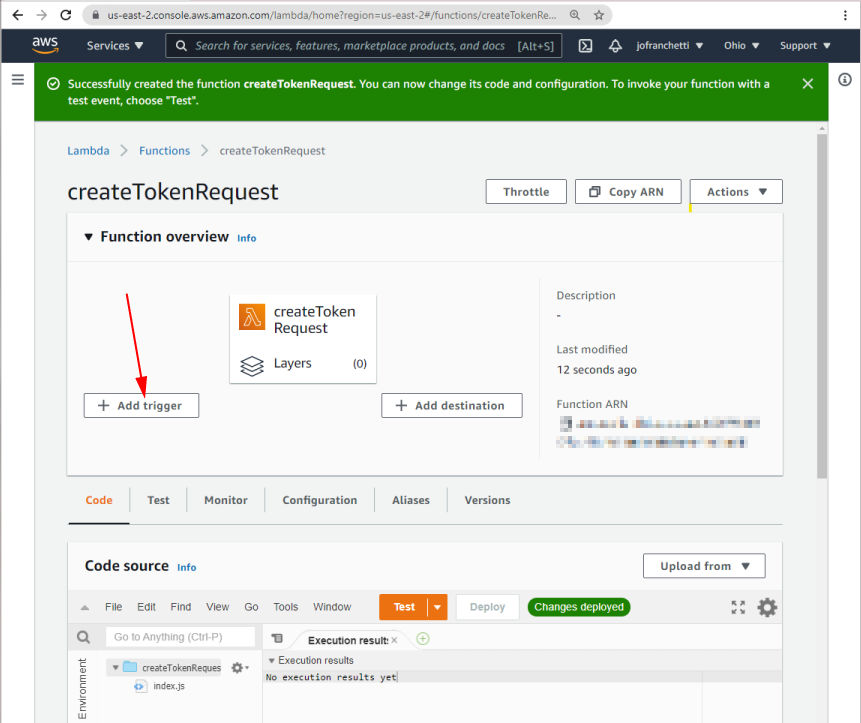
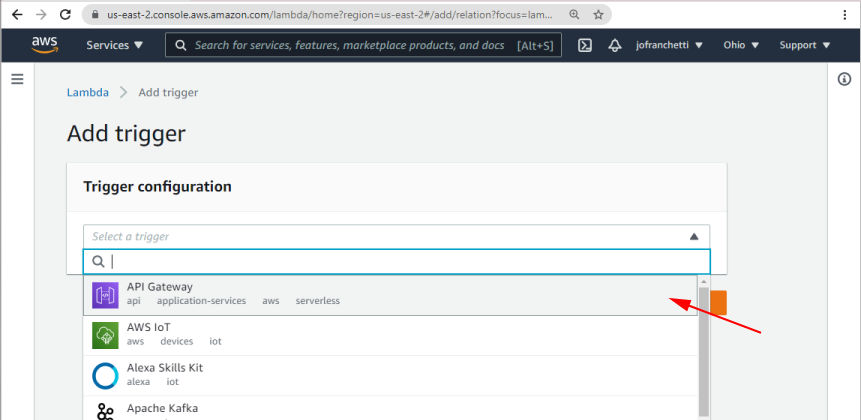
Once the function has been created, click “Add trigger” to make the Lambda function accessible over HTTP:
-
Select “API Gateway” from the “Trigger configuration” dropdown
-
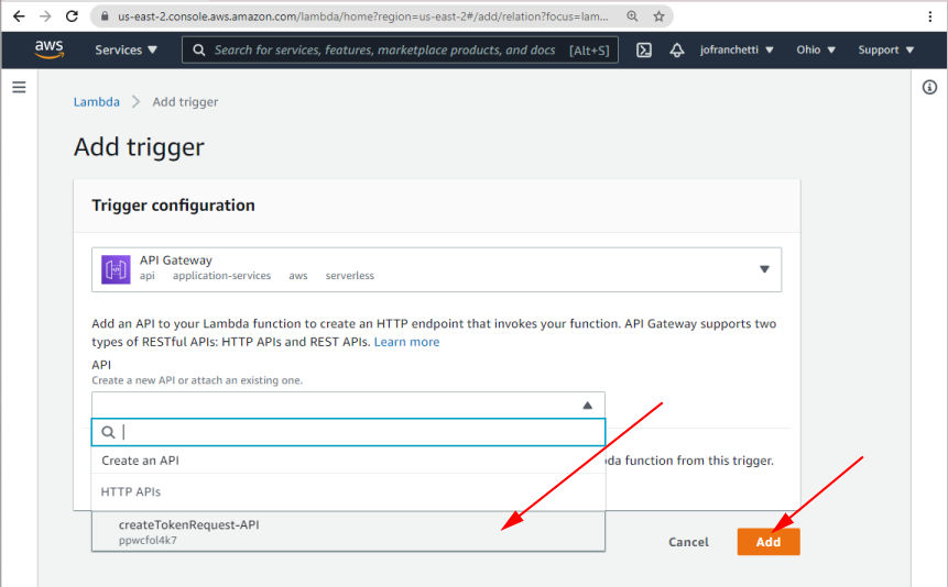
On the resulting page, select your function from the dropdown and click "Add".
-
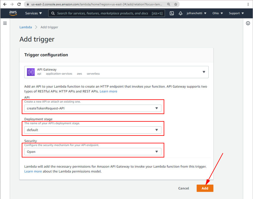
Set the Deployment stage to default and the Security to Open, then click "Add".
-
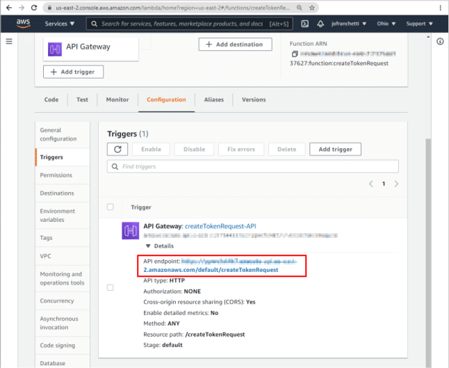
Once you have added your trigger, the UI shows a URL in the Triggers tab under Configuration. (This is what you will add as the
data-get-token-urlparameter when you use your component in the HTML, but we still have some more setup to do!)
-
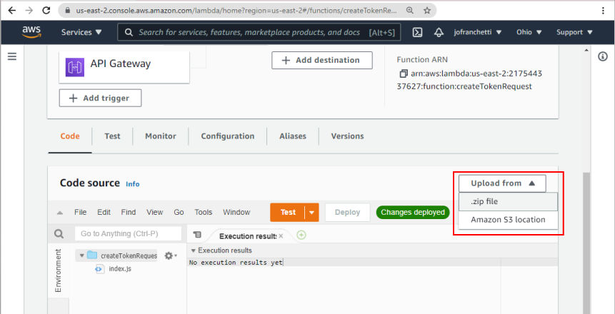
Now you need to upload the zip file that we created earlier. Click on the "Code" tab, then "Upload from" and select ".zip file":
-
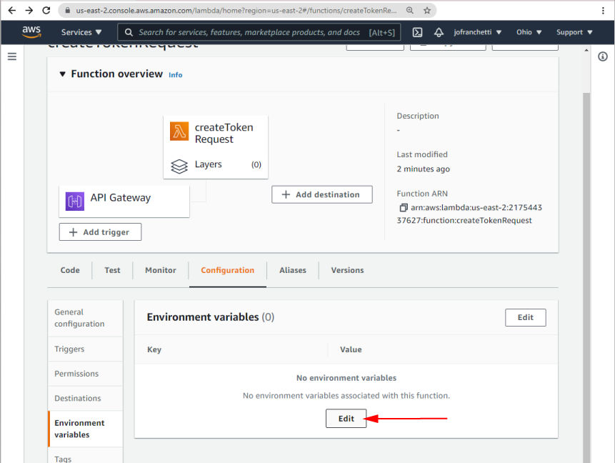
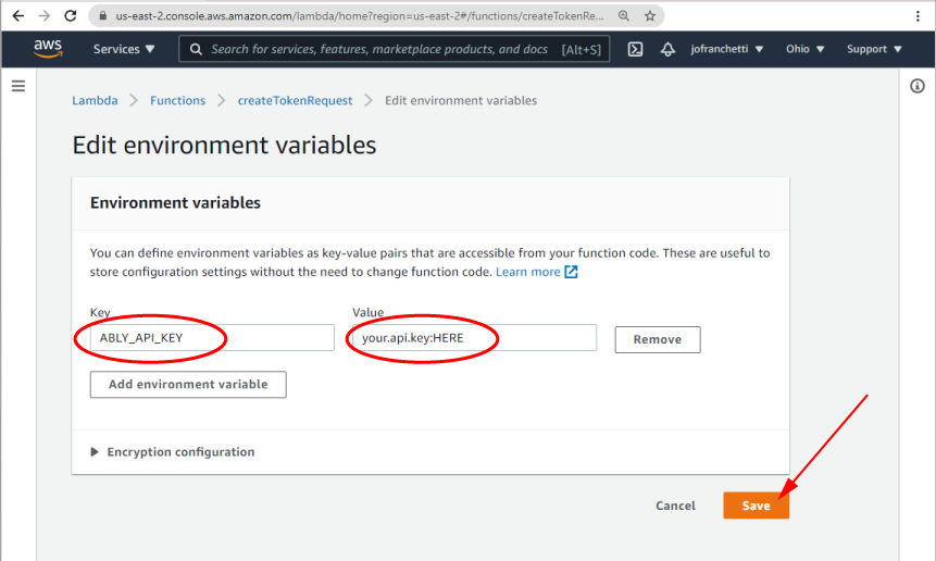
Once the zip file is uploaded, you will need to set up your environment variables with your Ably API key. Under "Configuration", select "Environment variables", then click the "Edit" button:
-
Add your Ably API key to the “Environment variables” settings
And that's it, your Lambda is set up
In the index.js file we’re reading from process.env.ABLY_API_KEY. You will need to generate a new ably API key and then define this environment variable, with its key value in the AWS UI (or using an automation tool of your preference).
Once our Lambda function is created, we’ll need to add an AWS API Gateway Trigger to give our lambda an externally accessible URL. This is the URL that we can safely configure in our HTML markup in lieu of our actual API key. The Ably SDK will take care of the rest.
<ably-chat data-get-token-url="https://yourapigatewayurlhere/createTokenRequest"></ably-chat>
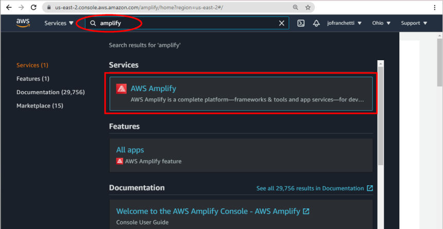
Now we can walk through hosting your component on Amplify, the AWS static web hosting service.
-
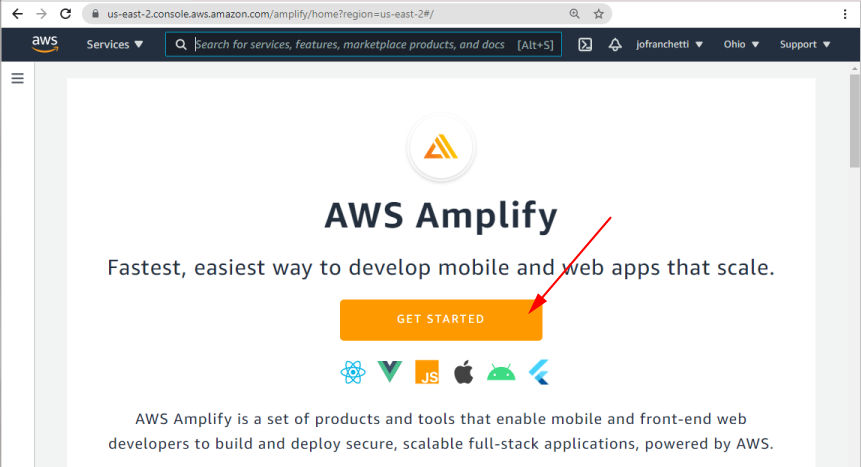
Search for Amplify in the Services search bar and click on the resulting AWS Amplify link.
-
Click "GET STARTED"
-
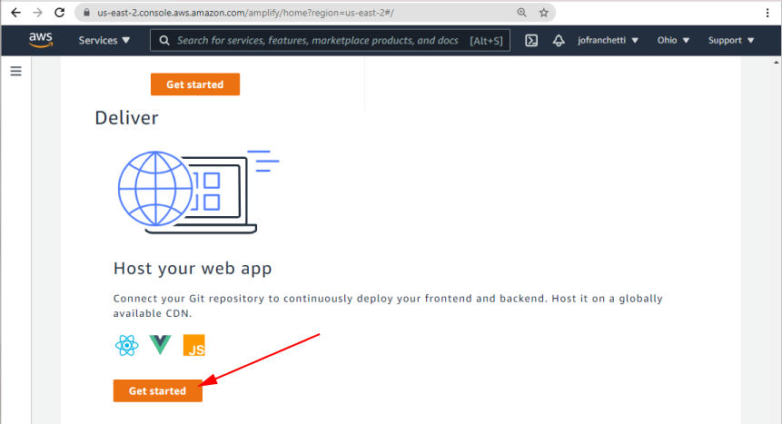
Scroll down the resulting page to "Host your web app, and click on "Get started":
-
Authenticate AWS Amplify with your GitHub account
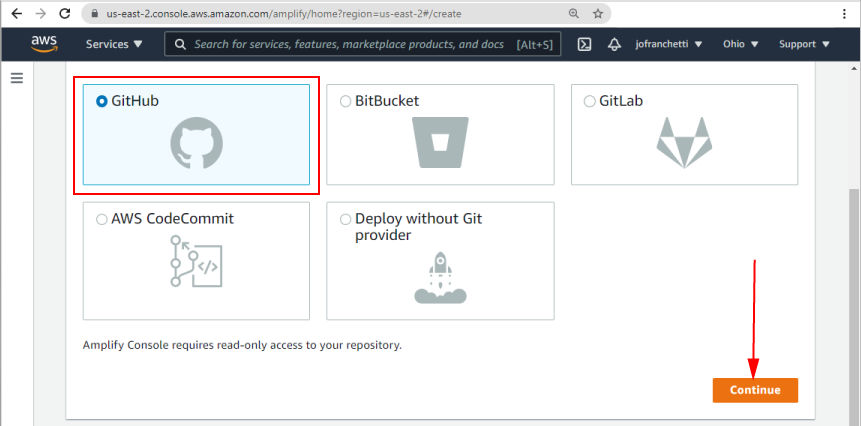
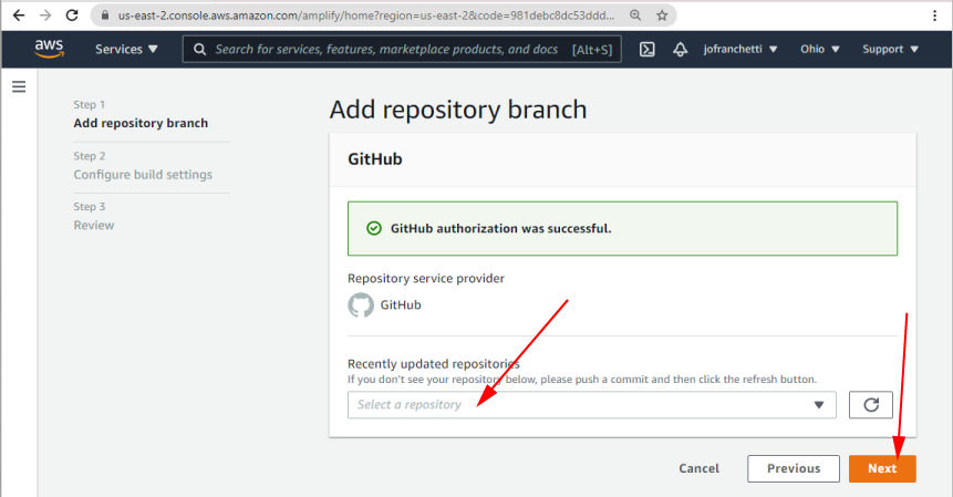
-
Select the repository of your web component
-
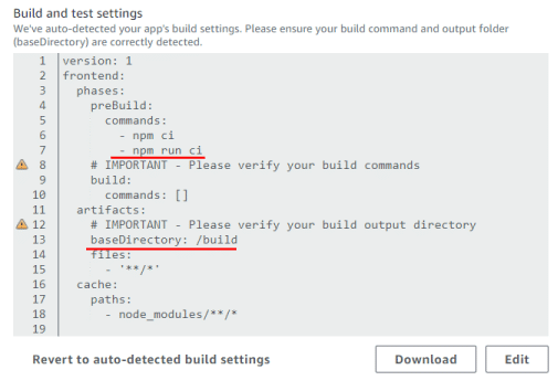
Edit your build settings to include
npm run cias a prebuild command and set the baseDirectory to "/build".
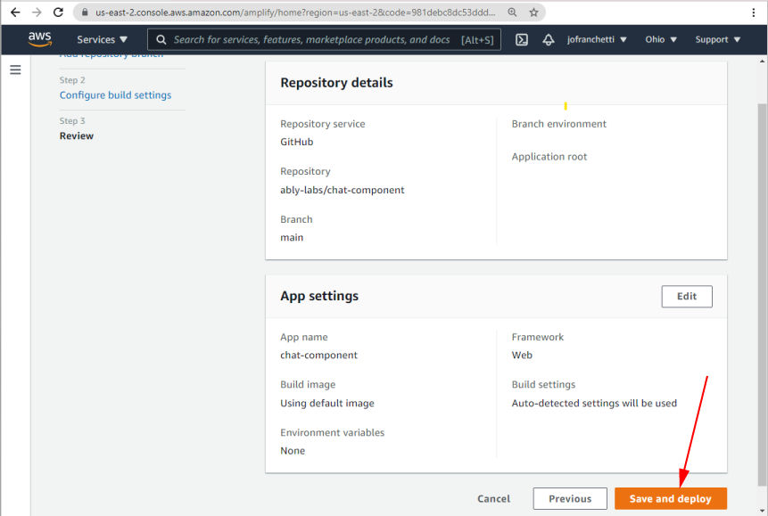
-
Click the "Save and deploy" button to host your component
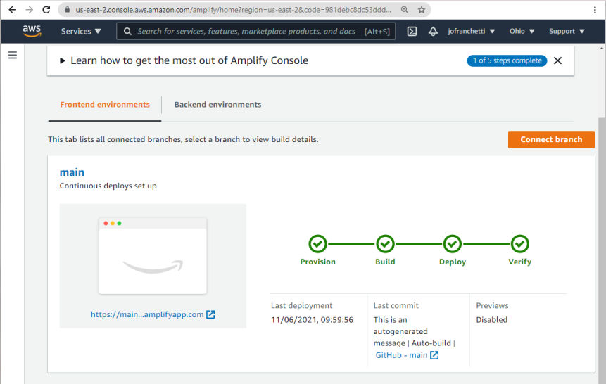
-
If all is well, the component will provision, build, and deploy successfully. The UI will provide you with a URL to view your hosted component.
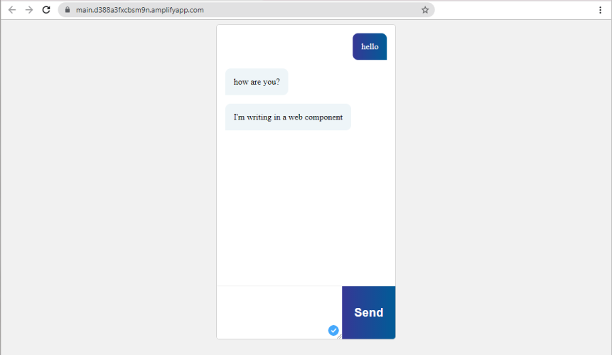
The hosted web component will look something like this
Using the NPM package

Because components are built as plain old JavaScript, we can distribute and consume the component using NPM and any of the variety of browser-friendly ways to add NPM packages to your front end.
Here at Ably, we’ve published the component to NPM as ably-chat-component, and you can reference it directly using the Skypack CDN. This ensures packages are browser-compatible.
<!DOCTYPE html>
<html lang="en">
    <head>
        <meta charset="UTF-8">
        <title>Ably Chat</title>
        <script src="https://cdn.ably.io/lib/ably.min-1.js" lang="text/javascript"></script>
        <script src="https://cdn.skypack.dev/ably-chat-component" type="module"></script>
    </head>
    <body>
        <ably-chat data-api-key="your-ably-api-key-here"></ably-chat>
    </body>
</html>
You need to reference the client-side Ably SDK for the component to work. However, once you have done that, you can reference the Skypack URL for our component, and add the ably-chat tag into your page, set your API key, and everything will just work.
This is the simplest supported way to use this component in development mode. As mentioned above, however, you will need to switch out your API key for a token request URL of your own.
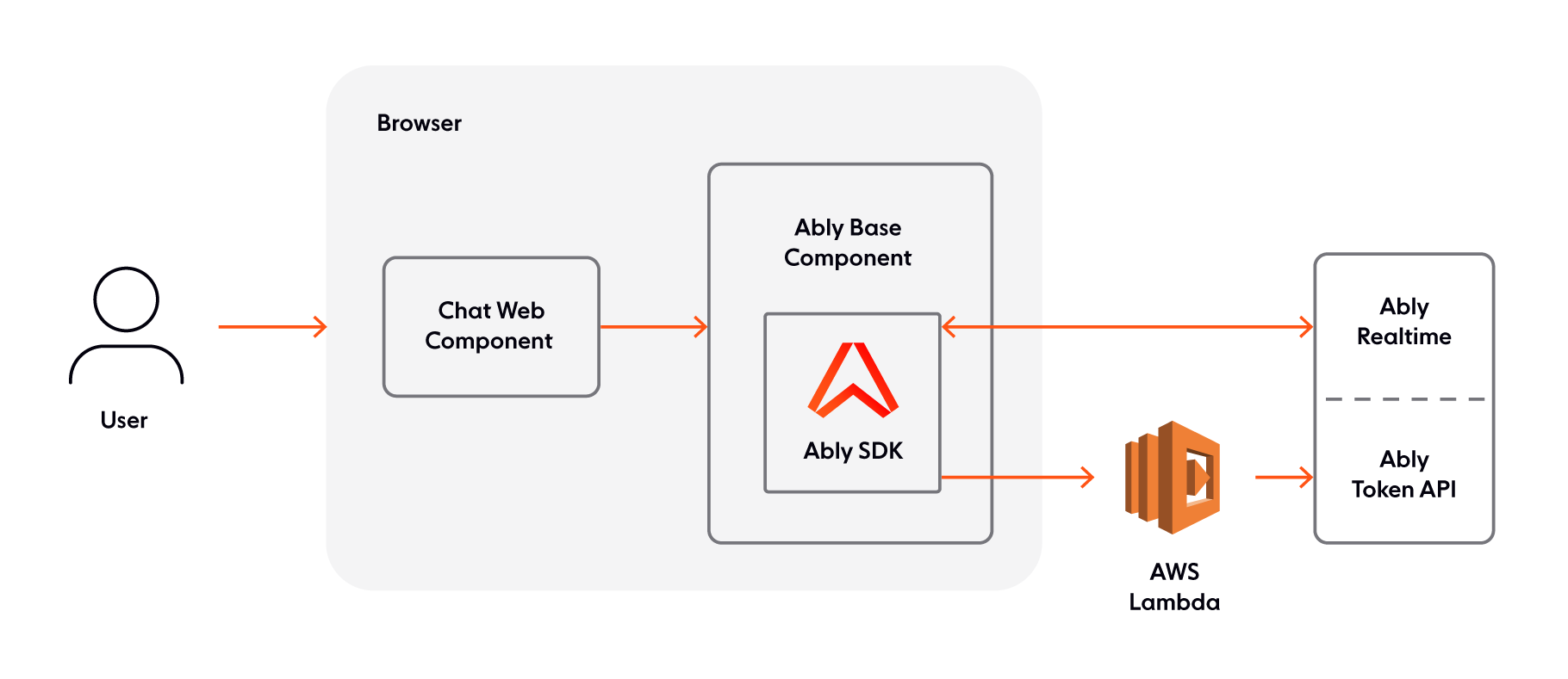
The Component Architecture
Illustrated, the component's architecture would look like this:
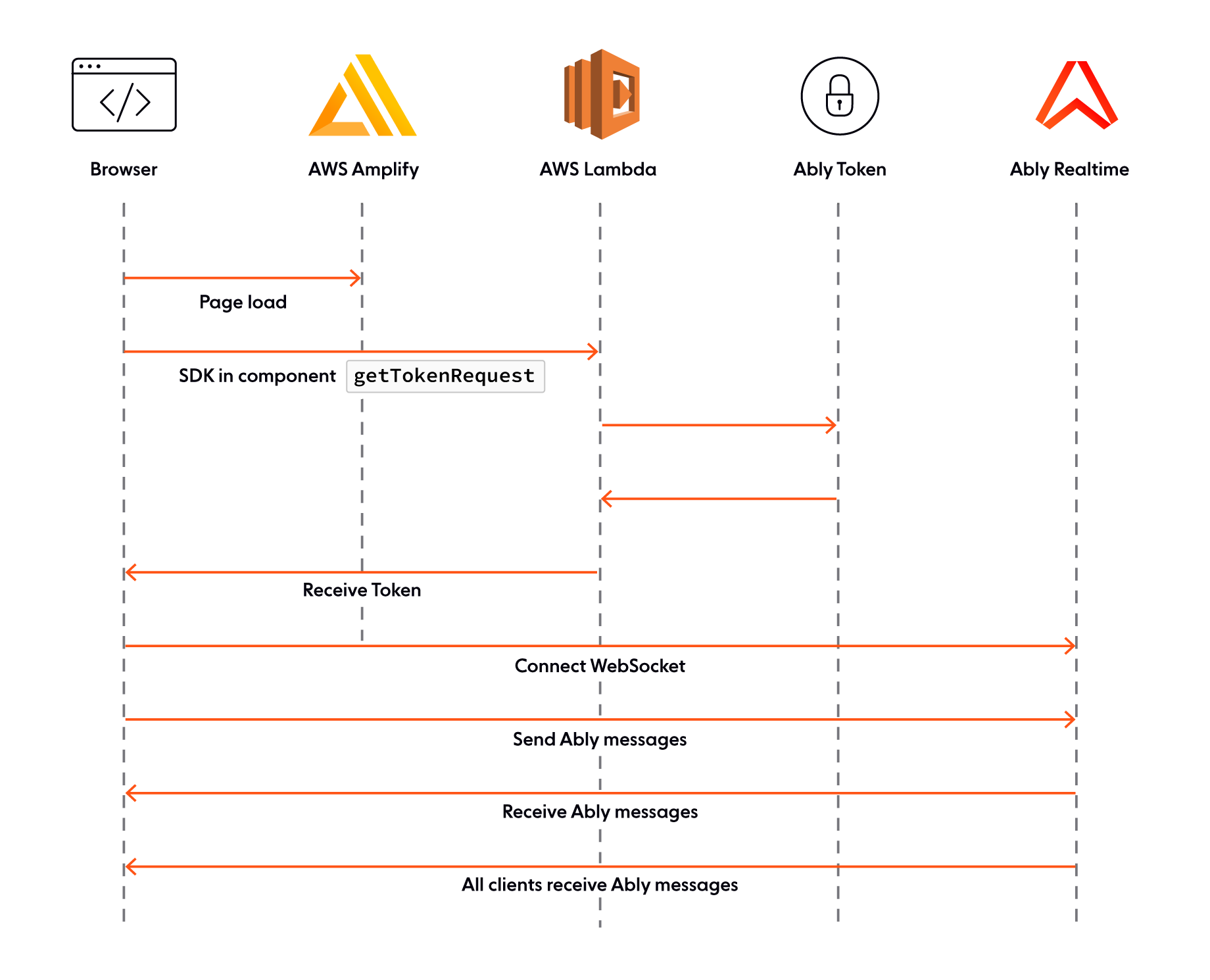
With this corresponding sequence diagram
In this piece we’ve broken down how web components work, explored Ably and Web Components, and walked through how we can use AWS Amplify and AWS Lambda to host applications that support realtime chat.
If you’ve already got a web application and know how to host it, we’ve also touched on how you can use Skypack to include this component directly from NPM.
Chat is just one way that you can use realtime messaging and Web Components, and we’d love to see what you can do with this codebase.
About Ably
Ably is an enterprise-grade pub/sub messaging platform. We make it easy to efficiently design, quickly ship, and seamlessly scale critical realtime functionality delivered directly to end-users. Everyday we deliver billions of realtime messages to millions of users for thousands of companies.
Our platform is mathematically modelled around Four Pillars of Dependability so we’re able to ensure messages don’t get lost while still being delivered at low latency over a secure, reliable, and highly available global edge network.
Take our APIs for a spin to see why developers from startups to industrial giants choose to build on Ably because they simplify engineering, minimize DevOps overhead, and increase development velocity.