More aspects of our work and life are online than ever before, and the trend towards remote work and increasingly remote teams is set to continue. Whilst we enjoy the freedom and flexibility that remote work provides, remote teams also face a significant challenge: establishing (and desiring) a sense of connection despite the physical distance between individuals.
Many employees express a loss of team spirit and community when they work remotely, which inadvertently impacts productivity. This has led to a rise in online collaboration tools and services, which strive to solve this problem by bringing the qualities and benefits of working in person to the virtual workspace. Specifically, they are using collaborative features to deliver the unspoken cues that we have lost in today’s virtual office environments. Meta information in the form of online presence, movement and focus provides a sense of togetherness and helps users to decide what to do next. This enhances not only team-based work - but also team health.
This article explores the features required to create a great virtual collaborative environment within applications - explaining the purpose of each feature from an end user perspective and the key UX considerations.
The essential role collaborative features play in the user experience
So, what are the essential ingredients needed in an application to make users feel they are part of an ‘in-person’ experience? There are two needs to accommodate: the emotional sense of ‘togetherness’, and the sense of being productive.
From an application perspective this means you need to provide users with three pieces of realtime information: “who is here with me?”, “where are they?” and “what are they doing?”. In a virtual, collaborative setting this information can be provided through the following collaborative features:
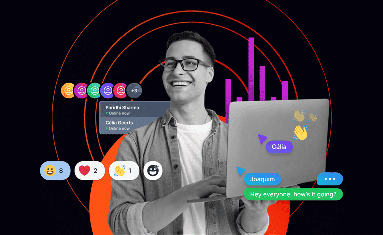
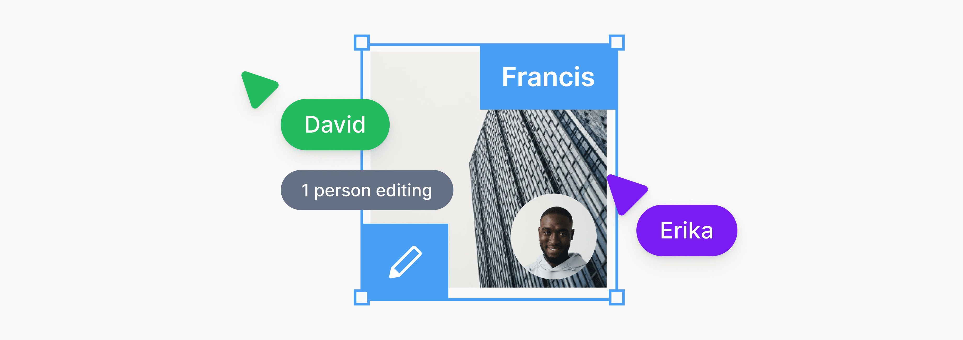
- Avatar stack: Who is here with me?
- Member location: Where are they?
- Live cursors: Where are they moving to?
- Component locking: What are they doing?
Let’s look at each of these in turn, and how they enhance the virtual collaborative experience.
Avatar stack
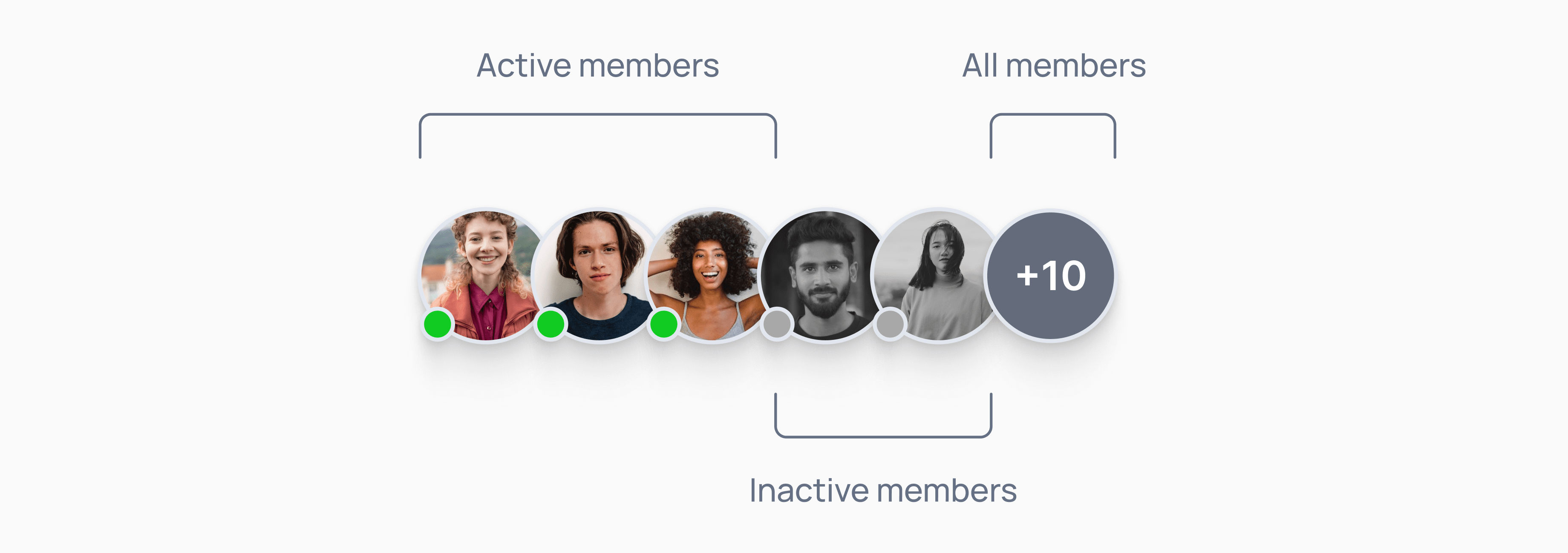
Avatar stacks show all the users currently collaborating within a shared space. They provide the virtual equivalent of being able to see who is sitting in a room with you. They can help users make informed decisions by indicating the connection state of fellow collaborators, e.g. are they online, offline or have recently left. Avatars can take various forms from photos to initials or symbols.
Member location
Member location is a way to show where fellow collaborators are located within a shared space. Similar to being able to see where people are in a room. This can be useful for understanding what other members are working on, and how their work might affect yours

Live cursors
Live cursors show the live pointer position of other collaborators. They can be useful to show what someone is currently looking at and their movement around a space. A bit like knowing if someone is looking at the whiteboard, their computer or out the window in a face-to-face session. This is what differentiates the purpose of live cursors from ‘member location’. A member location feature shows ‘what I’m working on’, whilst an animated live cursor shows ‘what I might be looking at’. They can take many forms from the conventional arrow to cursors showing names or avatars.

Component locking
Component locking can be a valuable tool for collaborative applications. A lock displayed over a particular component signals to other members that they are currently being edited. Based on that information they can choose to wait or move onto another task.
Component locking provides much more than a visual cue, however. It helps reduce the instances where users accidentally overwrite each other's work, which needs to be consolidated in the backend.

UX design considerations for collaborative features
Having looked at each of the features required to make virtual collaboration as close to in-person as possible, let’s consider the UX requirements for a great collaborative experience, and the features that contribute to it.
At the end of the day, UX is all about the user and helping them reach their goals. Therefore, any collaborative features should adhere to the following principles:
- Keep it simple: Eliminate visual clutter wherever possible, and cut any unnecessary elements or steps that complicate the user experience.
- Make it intuitive to use: Always consider function first over design. Any features you add should make it as effortless as possible for users to do what they came to do on your site or app.
- Don’t distract: Collaborative features are not meant to be the star of the show, they are meant as subtle visual gestures.
In addition, there are a number of best practices to consider on a feature-by-feature basis. Doing so will help ensure you are delivering maximum value to the user.
Best practices when building avatar stacks
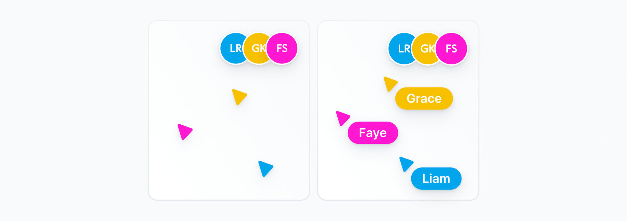
- Think about whether it is practical or beneficial to show a full list of collaborators to the user. For example only showing the avatars for online or recently left members, maybe sufficient. Listing everyone could be overwhelming to users, even degrading the experience.
- In instances where you must show the full list, make sure to order with the online members listed first. This will make it easier for users to see who is available to collaborate, without having to scroll through a long list of users.
- The value of instant updates to online status changes is often underestimated. Avatar stacks are huge contributors to unsaid virtual cues in a shared workspace, so make sure the status updates are reflected immediately in the UI, enabling users to take appropriate action based on that information.
Best practices when building a member location feature
- The level of detail that you provide about user location can vary depending on the needs of your users. For example, you might only show the page that a user is on, or you might show the specific component that they are working on.
- There are a variety of ways to display user location, such as using a border matching the member's avatar, the avatar itself, or a textual name.
- Member location is meant to provide a subtle, visual cue indicating who is working on what. The UI should not distract from the core application or components being worked on.
- As with avatar stacks, don’t underestimate the importance of instant updates to member location. Make sure the location updates are reflected immediately in the UI so users take appropriate action based on that information.
- Avatar stacks can be used in conjunction with member location to show where exactly someone is within a space - allowing them to jump to their location or follow their movements.
Best practices when building live cursors
- Understanding the true value of live cursors is important. Make sure they are not a distraction. Consider how many users may need to work synchronously in the same space. Cursors for a few people are fine, but beyond that the UI becomes so busy that any benefits they would provide are gone.
- The movement of cursors has to be smooth and performant. Jerky movements or having cursors jump around from place to place, will reflect poorly on the entire experience.
- The beauty of live cursors is that it shows the movements of others around you. It is not about watching an animated view of your own cursor. The original cursor will suffice. Not only will this prevent confusion on “who am I again?” but it also means there are no issues like lag to deal with.
- When multiple users are active in close proximity it can be difficult to understand who’s who, especially when things are fast moving. In such instances just matching the cursor colour to an avatar is not enough, consider instead the addition of a name and/or avatar to enhance the UX.
- Make sure the cursor position is adjusted to the screen size. This will ensure that whatever a user is pointing to is accurately reflected to everyone on different devices - even if that means adjusting to different layouts.
- Live cursors can extend way beyond pointing and showing movement around a space. Tracking the movement of the cursors also presents the opportunity to:
- Replay the ‘drag and drop’ animation for UI components.
- Show mouse interaction, such as clicks, mouse drag etc.
- Allow users to annotate and draw on the board.
- Add emotions to a cursor.
Best practices for building a component locking feature
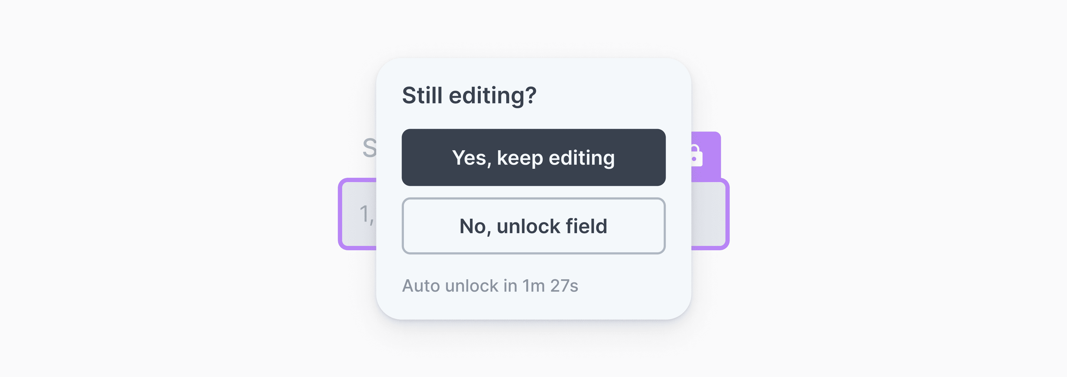
- There may be times where a user forgets they have locked a field or their connection drops. Ensuring the lock status is tied to a member's online status is useful in making sure that no components are locked indefinitely - the APIs in the Spaces SDK do this by default.
- A user may have locked a component but might have stepped away from the system for a long time. It might be a good idea to trigger a dialogue after a certain period of inactivity to check if the user is still there and working on the locked component. Lacking any response, the lock may be automatically released.
Adding in-app collaboration
Adding collaborative features, can greatly enhance the end user experience. But there is much to consider, not just from the POV of the user but also the implementation and performance of the features e.g. optimizing for the payload structure, frequency of updates, etc. This often means developer focus is diverted onto figuring out architecting the lower-level detail rather than the application.
Creating collaborative environments in a few lines of code
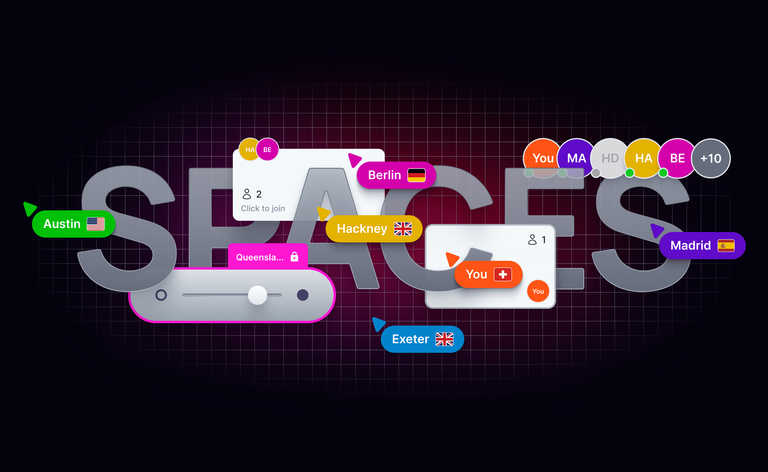
For the reason mentioned above, we came up with a new product “Spaces” — to help developers build collaborative spaces in their apps in just a few lines of code. The Spaces SDK comes with a set of simple, intuitive realtime collaboration APIs for a range of features. With these you can set up a virtual environment, where members can see: a live view of other collaborators working with them; their location within the app, their movement around the space when working on different components, and components actively locked for editing. APIs can be used individually or in combination to create the perfect collaborative space for your users - with minimal effort on your part. We have worked through the architectural challenges of integrating these features, so you can focus on the UX.
See the Spaces product page and play with our interactive demo or head straight to docs to learn more on the APIs.