
We’ve all been there: you’re building a chat experience and end up spending way too much time on UI glue - message bubbles, room lists, typing indicators… all before you even get to the good part: real-time logic.
So today, we’re launching a set of lightweight, flexible UI components built for React and powered by Ably Chat. These components are designed to help you move fast, whether you want to prototype something in an afternoon or build a full-featured chat interface that just works.
npm install @ably/chat-react-ui-components @ably/chat
Why we built this
Developers told us they loved the real-time power of Ably Chat, but didn’t want to reinvent message bubbles every time they started a project.
So we built a UI kit that gives you:
- A full, working chat layout with sensible defaults
- Atomic components to mix, match, and style as you like
- Deep integration with Ably Chat for presence, reactions, and history
- A chance to skip the scaffolding and focus on real features
- A starting point with all of the difficult details worked out, if you want to ship your own components
What’s in the box
Here’s what you’ll find in this first release:
All components are React-first, unopinionated, and work out of the box with Ably Chat providers. You can go from zero to full chat UI in under 10 minutes, or just pull in a few pieces if you're building something custom.
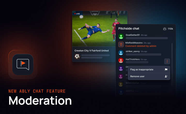
And here's how it looks in action:
Quick start
Spin up a Vite + React app and install the packages:
npm create vite@latest my-chat-ui-app -- --template react-ts
cd my-chat-ui-app
npm install @ably/chat-react-ui-components @ably/chat
Then drop in the App component:
import * as Ably from 'ably';
import { ChatClient } from '@ably/chat';
import { App } from '@ably/chat-react-ui-components';
import '@ably/chat-react-ui-components/dist/styles.css';

const ablyClient = new Ably.Realtime({
    key: '{{API_KEY}}',
    clientId: 'your-chat-client-id',
});

const chatClient = new ChatClient(ablyClient);

ReactDOM.createRoot(document.getElementById('root')!).render(
	<ChatClientProvider client={chatClient}>
		<ThemeProvider>
			<ChatSettingsProvider>
				<AvatarProvider>
					<App initialRoomNames={['my-first-room']} />
				</AvatarProvider>
			</ChatSettingsProvider>
		</ThemeProvider>
	</ChatClientProvider>
);
And there you have it - you’ve now got real-time messaging, presence, and reactions with a fully responsive UI.
Prefer full control?
If you’d rather build your own layout, the kit is fully composable. You can wrap just the providers you need and render atomic components wherever they make sense.
<ThemeProvider>
    <AvatarProvider>
        <ChatSettingsProvider>
            <ChatClientProvider client={chatClient}>
                {/* Your layout here */}
                <RoomList />
                <ChatWindow roomName="general" />
            </ChatClientProvider>
        </ChatSettingsProvider>
    </AvatarProvider>
</ThemeProvider>
Everything’s context-driven and modular, so you’re never locked in.
Real-world ready
This is more than a UI demo. The components are designed for:
- Live customer support tools
- Team chat apps or collaboration dashboards
- In-app messaging for mobile or web products
- Internal tooling that needs realtime conversations
The design is responsive, the performance is solid, and it all sits on top of Ably’s realtime edge network. So if you’re already using Ably Chat, the UI kit plugs in directly.
You’ll also get:
- Full TypeScript support
- Tailwind-compatible classes (but you can use anything)
- ESLint + Prettier config out of the box
- Reactions, typing indicators, and presence baked in
- Sensible defaults, but full override control
And if you want to hook into message editing, reaction logic, or custom avatars, the kit gives you the handles to do that too.
Get started today
npm install @ably/chat-react-ui-components @ably/chat
Read the full documentation to learn more!