Component libraries are essential tools for efficient React development. They provide a collection of pre-built UI components that can be reused across projects, saving developers time and effort.
In this article, we'll explore some of the best React component libraries that can boost your productivity and enhance your user interface. Whether you need a simple button, a complex dashboard, or anything in between, you will find a suitable component library for your React project.
What are React component libraries?
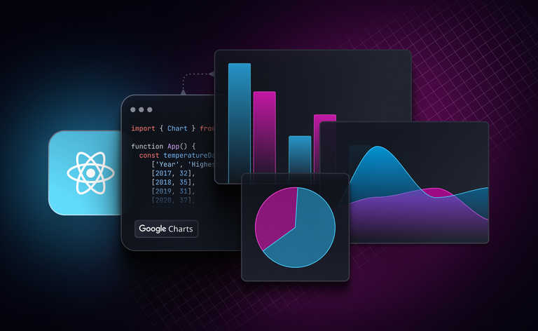
React component libraries are collections of reusable UI components, sometimes referred to as React UI libraries, designed for use with the React JavaScript library. These libraries offer a range of components, such as buttons, forms, tables, and charts, helping developers to create complex and engaging user interfaces.
Why use React component libraries?
React UI libraries and component collections offer numerous advantages, making them a compelling choice for developers.
Some of the key use cases for React component libraries include:
- Implementing common UI patterns: Component libraries provide a wide range of pre-built UI components that can be used to implement common UI patterns. This can save developers a significant amount of time and effort, as they do not have to design and develop these components from scratch.
- Ensuring consistency: React UI component libraries help ensure consistency across projects, benefiting large teams working on multiple projects.
- Enhancing quality: Top React component libraries are often well-tested and maintained, ensuring high quality.
- Reducing development costs: By using the best component libraries for React, developers can reduce overall development costs.
- Increased productivity: By using pre-built components, developers can save a significant amount of time and effort. This allows them to focus on the more complex aspects of their applications.
- Reduced risk: Well-tested and maintained libraries help to reduce the risk of introducing bugs into applications.
- Access to expertise: Component libraries are often developed by teams of experienced developers. This means that developers can benefit from the expertise of these developers when using their libraries.
- Community support: Many component libraries have active communities of users. This means that developers can get help and support from other users if they encounter problems.
Considerations when choosing a library
When choosing a React component library, it is important to consider a number of factors, including:
- Project needs: Does the library provide the components and features that are required for your project? Consider the scale and type of your project, as well as any specific requirements that you have. For example, if you are building a large enterprise application, you will need a library that can support a high level of complexity.
- Longevity: How frequently is the library updated? Is it likely to be supported in the future? It is important to choose a library that is and will continue to be actively maintained. This will help to ensure that you do not have to migrate to a new library in the future.
- Learning curve: How easy is it for a new developer to pick up and use the library? If you are working in a team, it is important to choose a library that is easy for new developers to learn.
- Customizability: Can the library be tailored to fit your brand's design guidelines? Some libraries are more customizable than others. If you have specific design requirements, you will need to choose a library that can be customized to meet your needs.
In addition to these factors, you may also want to consider the following:
- Community: Does the library have a large and active community? A large community can provide support and help you to resolve any problems that you encounter.
- Documentation: Is the library well-documented? Good documentation can make it easier to learn how to use the library and to find solutions to problems.
- Performance: How does the library perform? Some libraries are more performant than others. If you need a highly performant React component library, choose one that is known for its speed and responsiveness.
By carefully considering these factors, you can choose a React component library that is a good fit for your project.
Top nine React component libraries
There are various React component libraries available. Here’s our pick of the top nine React component libraries:
1. Material UI
Material UI is a React component library that implements Google's Material Design. It provides a comprehensive collection of pre-built components that are ready for use in production right out-of-the-box.
Features:
- Pre-built components: A comprehensive collection of pre-built components, including buttons, forms, tables, charts, and more.
- Accessibility: A focus on accessibility, ensuring that all components meet the highest standards for usability.
- Customizability: A suite of customization options that make it easy to implement your own custom design system.
- Theme support: Support for theming, allowing you to easily change the look and feel of your entire application.
- Strong community: A large and active community of users and contributors.
Use cases:
- Material UI can be used to build any type of React application, from simple websites to complex enterprise applications.
- It is especially well-suited for building applications that need to be visually appealing and consistent.
- Material UI is also a good choice for applications that need to be accessible to all users.
GitHub stars: 89.3k
GitHub link: https://github.com/mui/material-ui
Documentation: https://mui.com/material-ui/getting-started/
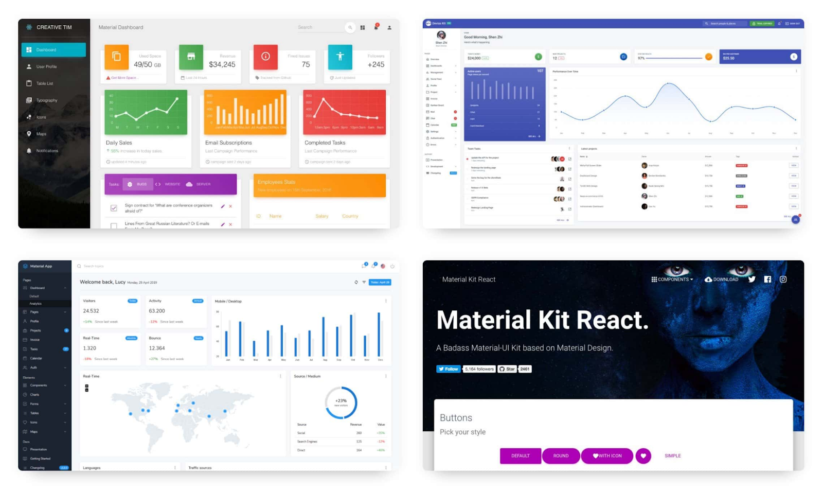
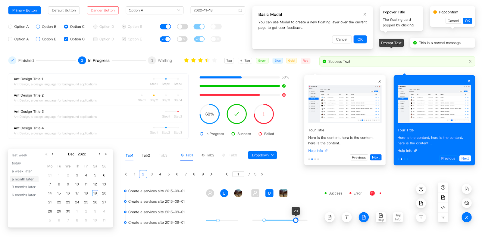
2. Ant Design
Ant Design is a React component library that implements Ant UMD, a design system for enterprise applications. It provides a comprehensive collection of pre-built components that are ready for use in production right out-of-the-box.
Features:
- Enterprise-level components: Ant Design provides a wide range of enterprise-level components, such as data tables, form layouts, and organization charts.
- Professional look: Ant Design's design system is more heavily influenced by Chinese design principles, resulting in a more elegant and professional look and feel.
- Out-of-the-box features: Ant Design offers a number of out-of-the-box features that are not available in Material UI, such as internationalization support and type safety.
- Customizability: Customizable options that simplify the implementation of your custom design system.
Use cases:
- Building enterprise-level applications with complex data tables, form layouts, and organization charts.
- Creating applications that require a more elegant and professional look and feel.
- Building applications that need to be internationalized or that require type safety.
GitHub stars: 88k
GitHub link: https://github.com/ant-design/ant-design
Documentation: https://ant.design/docs/react/getting-started
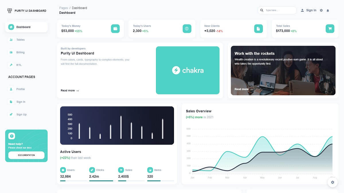
3. Chakra UI
Chakra UI is a modular and accessible React component library that provides you with the building blocks you need to build your React applications. It is designed to be simple, flexible, and extensible, and it provides a wide range of components, including buttons, forms, tables, charts, and more.
Features:
- Modular architecture: Chakra UI is designed to be modular, so you can easily import and use only the components you need.
- Accessibility: Chakra UI is committed to accessibility, and all of its components are designed to meet the Web Content Accessibility Guidelines (WCAG) standards.
- Theme support: Chakra UI provides built-in theme support, so you can easily customize the look and feel of your application.
- Extensibility: Chakra UI is extensible, so you can easily create your own custom components and themes.
Use cases:
- Building accessible React applications.
- Building modular and reusable React components.
- Creating custom React themes.
- Building React applications with a consistent look and feel.
GitHub stars: 34.7k
GitHub link: https://github.com/chakra-ui/chakra-ui
Documentation: Chakra UI | Getting Started
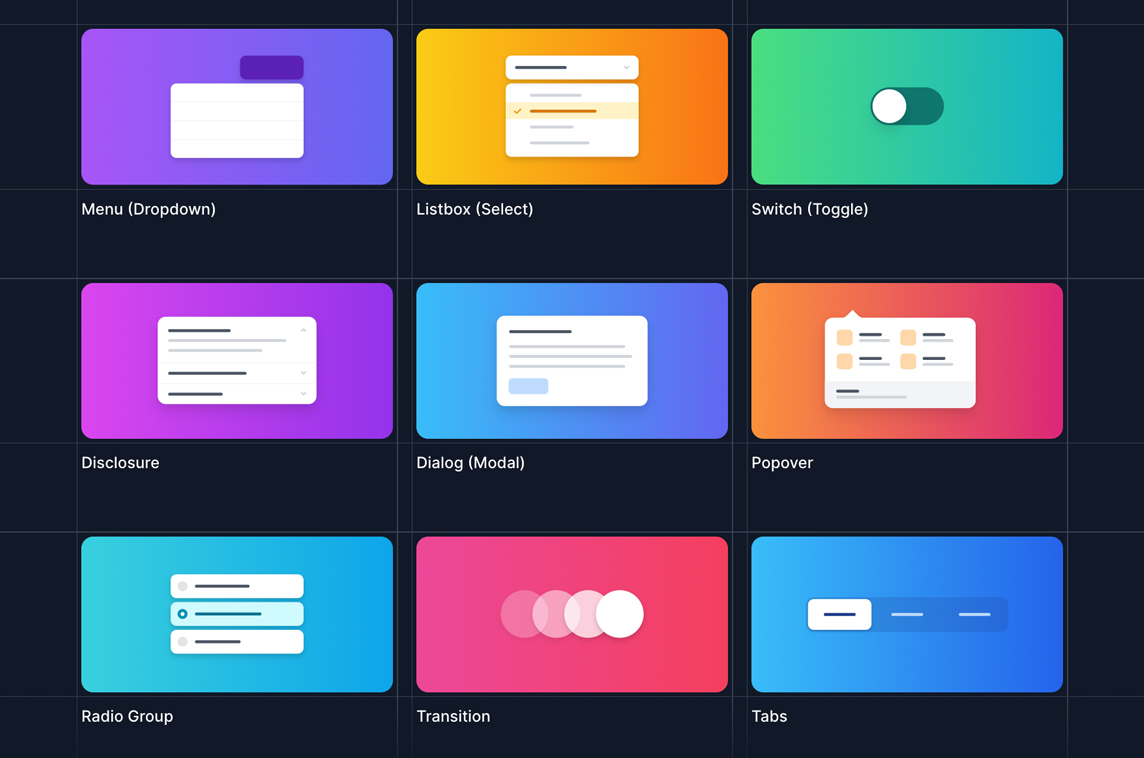
4. Headless UI
Headless UI is a React component library that provides a set of unstyled UI components that can be used to build custom UI components. This makes it a good choice for developers who want to have full control over the look and feel of their UI.
Features:
- Unstyled components: The components in Headless UI are unstyled, which means that you have full control over their appearance. This makes it easy to create custom UI components that match the design of your application.
- Accessible: All of the components in Headless UI are built to be accessible, so you can be sure that your applications will be accessible to users with disabilities.
- Well-documented: Headless UI is well-documented, with clear and concise examples for each component. This makes it easy to learn how to use the library and to start building custom UI components right away.
Use cases:
- Building custom UI components: Headless UI is a good choice for developers who want to have full control over the look and feel of their UI. By using the components in Headless UI, you can easily create custom UI components that match the design of your application.
- Building complex UI components: Headless UI is also a good choice for building complex UI components. By using the components in Headless UI, you can break down complex UI components into smaller, more manageable pieces.
GitHub stars: 22.5k
GitHub link: https://github.com/tailwindlabs/headlessui
Documentation: https://headlessui.com/
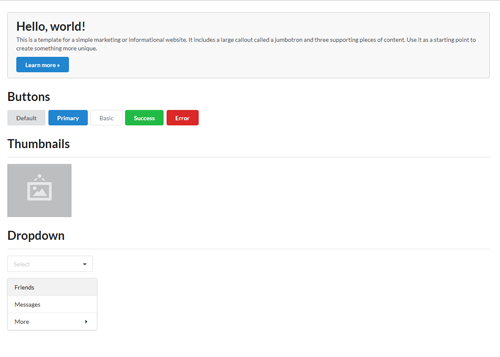
5. React Bootstrap
React Bootstrap is a popular React component library that implements the Bootstrap CSS framework. It provides a comprehensive collection of pre-built components that are ready for use in production right out-of-the-box.
Features:
- Mobile-first and responsive: React Bootstrap is designed to be mobile-first and responsive, so your applications will look great on any device.
- Flexible and customizable: React Bootstrap is flexible and customizable, so you can easily create your own custom components and themes.
- Well-documented and supported: React Bootstrap is well-documented and supported, with a large and active community of users and contributors.
Use cases:
- Building responsive web applications that adapt to different screen sizes and devices.
- Creating custom components that leverage the power of React hooks and state management.
- Integrating with other libraries such as react-router, formik, react-query, etc. to enhance the functionality and performance of the web applications.
- Developing interactive user interfaces that support animations, transitions, modals, tooltips, etc.
GitHub stars: 22k
GitHub link: https://github.com/react-bootstrap/react-bootstrap
Documentation: https://react-bootstrap.netlify.app/docs/getting-started/introduction/
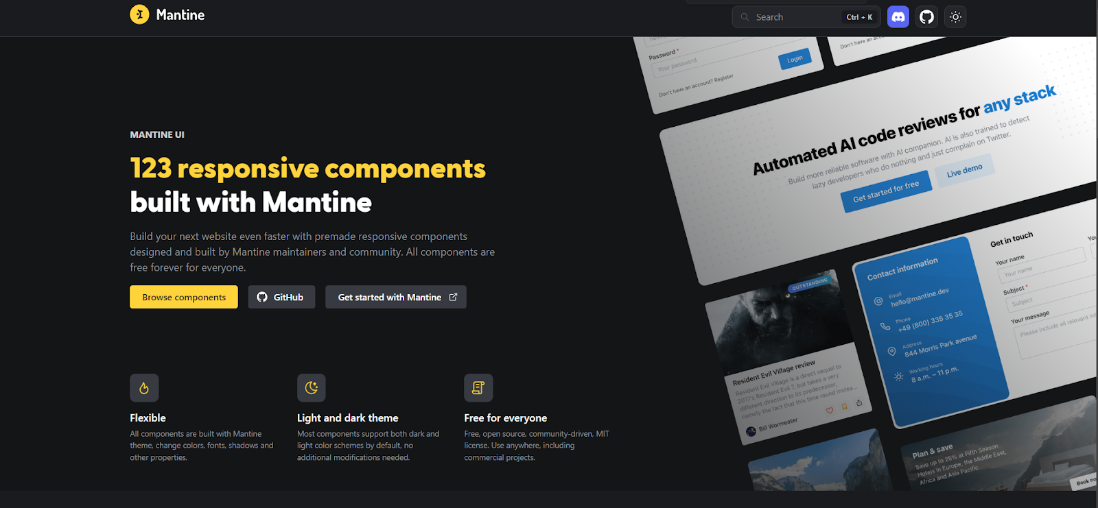
6. Mantine
Mantine is a React component library that provides a comprehensive collection of responsive, customizable, and accessible components that can be used to build modern web applications. It is designed with a focus on simplicity, flexibility, and performance, and it offers a wide range of features.
Features:
- Theme engine: Mantine provides a powerful theme engine that allows you to easily customize the look and feel of your application. The theme engine is also extensible, allowing you to create your own custom themes.
- Hooks library: Mantine provides a number of hooks that can be used to manage state and side effects in your React applications. Mantine hooks are designed to be easy to use and to work well with other React libraries.
- Customize components: Every Mantine component supports visual customizations with props – you can quickly prototype and experiment by modifying component props.
- Styles overriding: Each Mantine component supports styles overriding for every internal element inside with classes or inline styles. This feature alongside other customization options allows you to implement any visual modifications to components and adapt them to fit almost any design requirements.
- Flexible theming: Extend default theme with any amount of additional colors, replace shadows, radius, spacing, fonts and many other properties to match your design requirements.
Use cases:
- Customizing the appearance and behavior of components with theme and context providers.
- Integrating with popular libraries such as react-hook-form, react-query, react-table, etc.
- Building complex layouts and interactions with hooks and utilities.
- Developing and testing components in isolation with Mantine/Prism.
GitHub stars: 21.9k
GitHub link: https://github.com/mantinedev/mantine
Documentation: https://mantine.dev/getting-started/
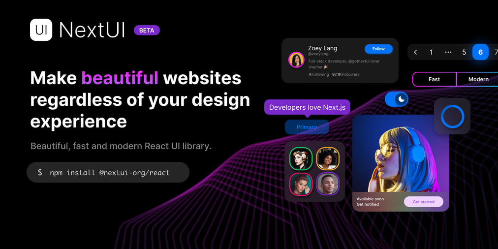
7. Next UI
Next UI is a React component library that provides a comprehensive collection of pre-built components that are designed to be fast, light, and accessible. It is built on top of React and Tailwind CSS.
Features:
- Custom themes: NextUI provides a custom TailwindCSS plugin that allows you to customize the default themes or create your own.
- Accessibility: NextUI components are built on top of React Aria ensuring exceptional accessibility support as a top priority.
- Dark mode: NextUI comes with a fully well-scaled default dark theme that you can apply to your application with just adding the dark attribute to your html.
- Easy customizations: NextUI is based on Tailwind Variants, it simplifies component slots customization while avoiding Tailwind class conflicts.
Use cases:
- You can use Next UI to leverage the React component model and hooks to manage the state and behavior of your UI elements.
- It is compatible with React, Vue, and Angular frameworks, and supports TypeScript and Sass.
- It is used for building web applications that need to be supported in both dark and light mode.
- You can use Next UI to build web applications that need to be translated into multiple languages.
GitHub stars: 16.3k
GitHub link: https://github.com/nextui-org/nextui
Documentation: https://nextui.org/docs/guide/introduction
8. Semantic UI React
Semantic UI React is a React component library that implements the Semantic UI CSS framework. It provides a comprehensive collection of pre-built components that are ready for use in production right out-of-the-box.
Features:
- Semantic HTML: Semantic UI React is built around the concept of semantic HTML, which means that the components are named and structured in a way that makes it easy to understand their purpose.
- Accessibility: Semantic UI React is committed to accessibility, and all of its components are designed to meet the Web Content Accessibility Guidelines (WCAG) standards.
- Theming: Semantic UI React provides built-in theming support, so you can easily customize the look and feel of your application.
- Extensibility: Semantic UI React is extensible, so you can easily create your own custom components and themes.
Use cases:
- Building accessible React applications.
- Building React applications with a consistent look and feel.
- Creating custom React components and themes.
- Building React applications that need to be translated into multiple languages.
- Building React applications that need to be integrated with third-party libraries and services.
GitHub stars: 13.1k
GitHub link: https://github.com/Semantic-Org/Semantic-UI-React
Documentation: https://react.semantic-ui.com/usage
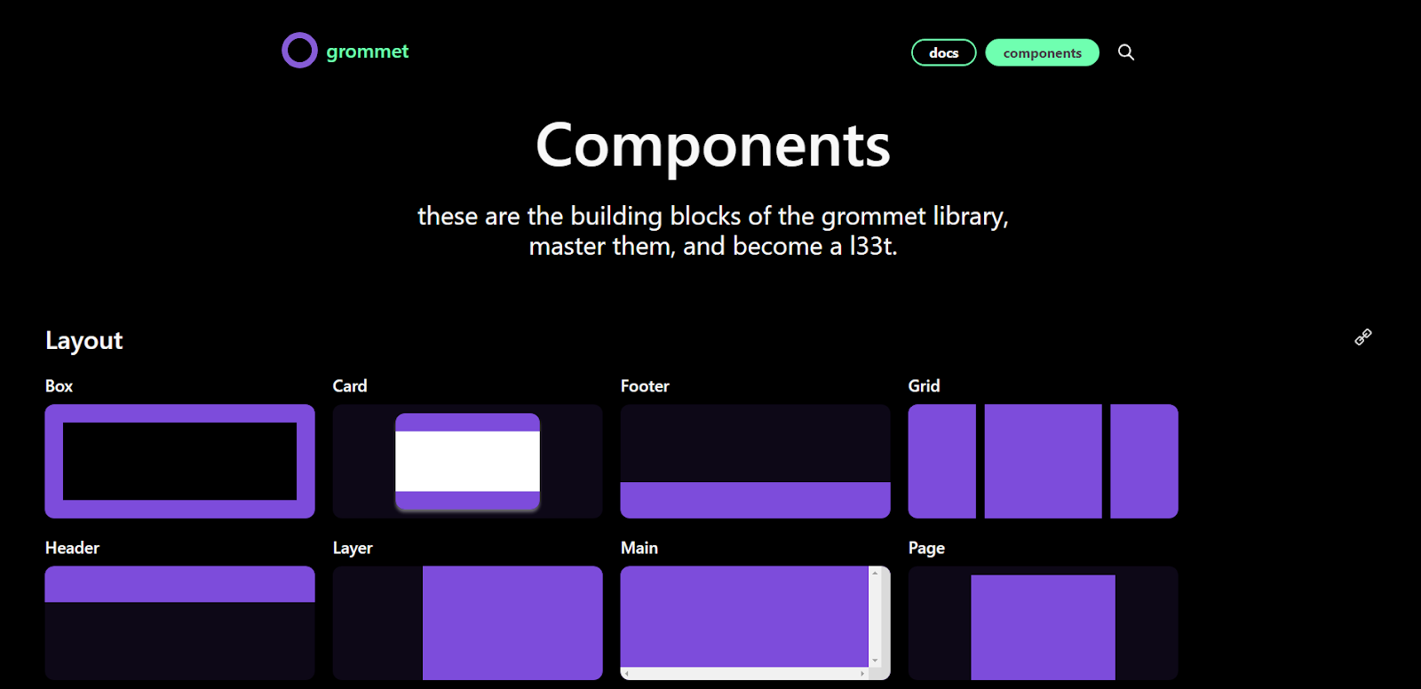
9. Grommet
Grommet UI is a React component library that provides a comprehensive collection of accessible, reusable, and responsive components that can be used to build modern web applications. It is designed with a focus on accessibility, performance, and usability.
Features:
- Theming: Grommet UI provides a powerful theming system that allows you to easily customize the look and feel of your application.
- Styling: Grommet UI components are styled with CSS-in-JS, which gives you full control over the appearance of your application.
- Accessibility: Grommet UI is committed to accessibility, and all of its components are designed to meet the Web Content Accessibility Guidelines (WCAG) standards. .
Use cases:
- You can use Grommet to create responsive and accessible web applications that follow the WAI-ARIA guidelines and support keyboard navigation, screen reader, and typeahead.
- You can use Grommet to import individual components like buttons, alerts, forms, etc. without depending on jQuery or other JavaScript libraries. You can also customize the component slots using Tailwind variants.
- You can use Grommet to leverage the React component model and hooks to manage the state and behavior of your UI elements.
- You can use Grommet for building web applications that need to be translated into multiple languages.
GitHub stars: 8.3k
GitHub link: https://github.com/grommet/grommet
Documentation: https://v2.grommet.io/docs
React component libraries compared
The best way to choose a React component library is to consider your specific needs. If you are looking for a library with a unique design system, then Material UI, Ant Design, or Chakra UI is a good choice. If you are looking for a library that is focused on accessibility, then Semantic UI React is a good choice. If you are looking for a library that gives you full control over the look and feel of your UI, then Headless UI is a good choice. If you are looking for a library with unique features, such as server-side rendering or dark mode support, then Grommet, Mantine, or Next UI is a good choice.
Choosing the right component library can greatly accelerate the development of your React application. Each library has its strengths, so the best one for your project largely depends on your requirements. Here's a comparison of the nine React component libraries discussed to help you make an informed decision:
| Library / Feature | Component Coverage | Customizability | Performance | Documentation | Community Support | Built-in Theming | Tree Shaking | Accessibility Features | Mobile Responsive | Popularity (GitHub Stars) |
|---|---|---|---|---|---|---|---|---|---|---|
| Material UI | High | High | Good | Excellent | Excellent | Yes | Yes | Good | Yes | High |
| Ant Design | High | High | Good | Excellent | Very Good | Yes | Yes | Good | Limited | High |
| Chakra UI | Moderate | High | Very Good | Excellent | Good | Yes | Yes | Excellent | Yes | High |
| React Bootstrap | High | High | Good | Excellent | Excellent | Limited | Yes | Good | Yes | Very High |
| Semantic UI React | High | High | Good | Very Good | Good | Limited | Yes | Good | Yes | High |
| Headless UI | Low | Very High | Excellent | Good | Good | No | Yes | Excellent | Depends | Moderate |
| Grommet | Moderate | High | Good | Good | Moderate | Yes | Yes | Good | Yes | Moderate |
| Mantine | Moderate | High | Good | Good | Good | Yes | Yes | Very Good | Yes | Moderate |
| Next UI | Moderate | High | Good | Good | Moderate | Yes | Yes | Good | Limited | Moderate |
Wrapping up: Choosing the right React component library
Selecting the appropriate React component library for your project isn't just about following trends or picking the most popular one. It's about ensuring that the library aligns with the specific requirements, design goals, and technical constraints of your project. Your choice can significantly impact the speed of development, ease of maintenance, and the overall user experience.
When deciding, always weigh the pros and cons in the context of your project. For example, while one library might excel in customization, another might shine in performance. It's all about finding the balance that caters to your project's unique needs.
Diving deeper is always a good strategy. There are countless community forums and discussion groups that can provide insights, reviews, and experiences related to React component libraries. Engaging with these communities can help you gain perspectives that aren't covered in articles or official documentation.
We're always eager to know what our readers are up to. If you're working on an exciting project or have interesting insights about React libraries, especially for notifications or other realtime use cases, do share with us. Tweet us at @ablyrealtime or join the conversation in /r/ablyrealtime. We'd love to hear from you!