# Ably Chat UI React Kit
# Components
This page documents the components available in the Ably Chat React UI Kit. These components provide a comprehensive UI for building chat applications with Ably.
## Styling and Theming
The Ably Chat React UI Kit use Tailwind CSS for styling. Here's how styling works and how you can customize the appearance of the components:
### CSS Import
The components come with pre-compiled CSS that you can import directly into your application:
#### React

```
// Import the pre-compiled CSS
import '@ably/chat-react-ui-kit/dist/style.css';
```
This CSS file contains all the necessary styles for the components, compiled from the Tailwind utility classes used in the component code. You don't need to install Tailwind CSS in your project to use these components.
### Light and Dark Mode
The components support both light and dark modes through the `ThemeProvider`:
#### React

```
import { ThemeProvider } from '@ably/chat-react-ui-kit';

// Basic usage with default options


// With custom configuration


```
The `ThemeProvider` manages theme state and automatically applies the appropriate CSS classes to enable light or dark mode styling. It also provides a `useTheme` hook that you can use to access and change the current theme:
#### React
```
import { useTheme } from '@ably/chat-react-ui-kit';
function ThemeToggle() {
const { theme, toggleTheme } = useTheme();
return (
);
}
```
### Customizing Component Styles
Currently, there are two main ways to customize the appearance of components:
1. **Using the `className` prop**: Most components accept a `className` prop that allows you to add custom CSS classes:
#### React

```

```
2. **Component-specific style props**: Some components have specific props for styling, such as the `Avatar` component's `color` prop:
#### React

```

```
### Future Styling Improvements
We are planning to enhance the theming and customization capabilities in future releases:
- Full theming support with customizable color palettes
- Component-level style overrides through a theme context
- Additional theme variants beyond light/dark (e.g., high contrast)
- Custom user/brand theming options
These improvements will provide more flexibility for integrating the chat components into your application's design system.
## App
The `App` component is a complete, ready-to-use chat application that combines all the components above with sensible defaults. It's ideal for quickly prototyping a chat interface or seeing how everything fits together.
### Features
- Manages room state (adding, leaving, selecting rooms)
- Shows loading state when not connected
- Renders layout with Sidebar and ChatWindow
- Includes RoomInfo in header and RoomReaction in footer
- Handles connection status and error states
- Provides customizable width and height
- Shows empty state when no room is selected
### Props
| Prop | Description |
|------|-------------|
| `initialRoomNames` | An optional array of room names to populate the sidebar initially |
| `width` | Width of the app container |
| `height` | Height of the app container |
### Usage
#### React

```
import { App } from '@ably/chat-react-ui-kit';
import * as Ably from 'ably';
import { ChatClient } from '@ably/chat';
import { ChatClientProvider } from '@ably/chat/react';
import { ThemeProvider, AvatarProvider, ChatSettingsProvider } from '@ably/chat-react-ui-kit';
import '@ably/chat-react-ui-kit/dist/style.css';

// Create Ably Realtime client
const ablyClient = new Ably.Realtime({
  key: 'your-api-key',
  clientId: 'user-' + Math.random().toString(36).substring(2, 15),
});

const chatClient = new ChatClient(ablyClient);

// Basic usage
function QuickChatPrototype() {
  return (


  );
}

// With custom dimensions
function CustomSizedChat() {
  return (


  );
}
```
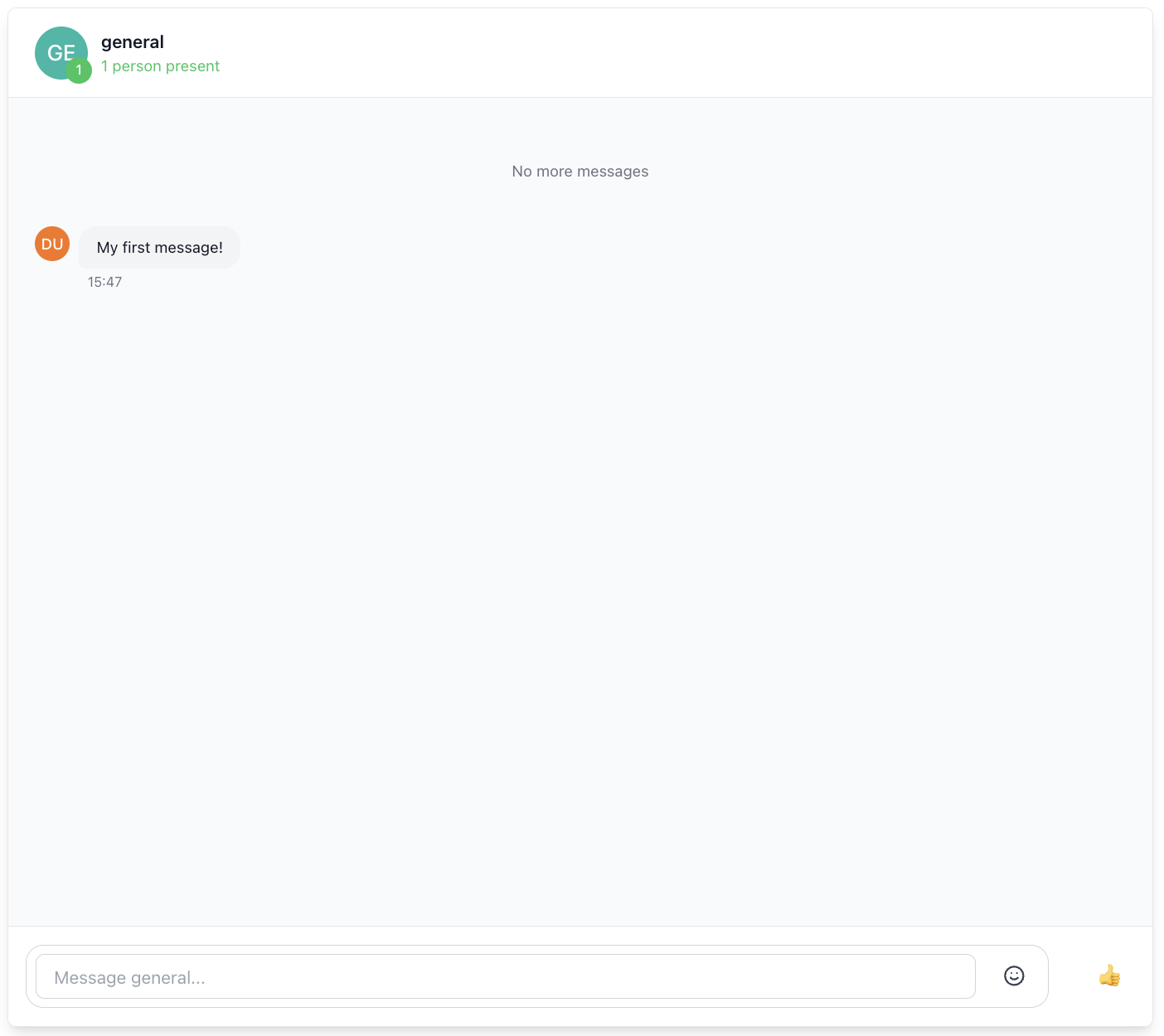
## ChatWindow
The `ChatWindow` component provides the main chat interface for a room. This includes message display, input, and custom header/footer content.
### Features
- Message display with history loading
- Message editing, deletion, and reactions
- Typing indicators and presence awareness
- Custom header and footer content
- Discontinuity recovery on reconnection
- Active chat window management to control which messages are rendered in the UI
### Props
| Prop | Description |
|------|-------------|
| `roomName` | Unique identifier for the chat room |
| `customHeaderContent` | Optional custom content for the header area of the chat window |
| `customFooterContent` | Optional custom content for the footer area of the chat window |
| `enableTypingIndicators` | Whether to show typing indicators in the chat window |
| `autoEnterPresence` | Whether to automatically enter presence when the component mounts |
| `windowSize` | Controls the window size for rendering messages in UI |
| `className` | Additional CSS class names to apply to the root container |
| `onError` | List of callbacks triggered when an error occurs in the chat window |
### Usage
#### React

```
import { ChatWindow, RoomInfo, RoomReaction } from '@ably/chat-react-ui-kit';
import { ChatRoomProvider } from '@ably/chat/react';

// Basic usage


// With custom header and footer

  }
    customFooterContent={}
  />


// With typing indicators disabled


// Setting a custom window size


```
### Integration with Other Components
The ChatWindow component integrates several other components:
- **ChatMessageList**: Displays the messages with infinite scrolling
- **MessageInput**: Allows users to compose and send messages
- **ChatWindowHeader**: Contains room information and controls
- **ChatWindowFooter**: Contains additional controls and features
## MessageInput
The `MessageInput` component provides a comprehensive text input interface for composing and sending chat messages. This component supports multi-line input, emoji selection, and typing indicators.
### Features
- Multi-line text input with automatic height adjustment (max 150px)
- Enter key to send (Shift+Enter for new line)
- Integrated emoji picker with cursor position insertion
- Typing indicators to alert others when composing messages
- Automatic input cleanup and focus management
- Accessible form controls with proper ARIA attributes

### Props
| Prop | Description |
|------|-------------|
| `onSent` | Callback function triggered when a message is sent |
| `placeholder` | Placeholder text displayed in the input field when empty |
| `className` | Additional CSS class names to apply to the input container |
| `enableTyping` | Whether to enable typing indicators on user input |
| `onSendError` | Callback triggered when an error occurs while sending a message |
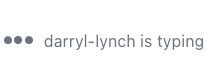
### Typing Indicators
The MessageInput component automatically triggers typing indicators when the user is typing. This is handled through the Ably Chat SDK's typing indicators feature:
- Triggered on each keystroke when content is present
- Automatically stopped when input is cleared or message is sent
- Integrated with the useTyping hook from @ably/chat/react
### Usage
#### React

```
import { MessageInput } from '@ably/chat-react-ui-kit';
import { useMessages } from '@ably/chat/react';

// Basic usage
const { sendMessage } = useMessages();

const handleSendMessage = (text: string) => {
  console.log(`Sending message: ${text}`);
  sendMessage({ text });
};


```
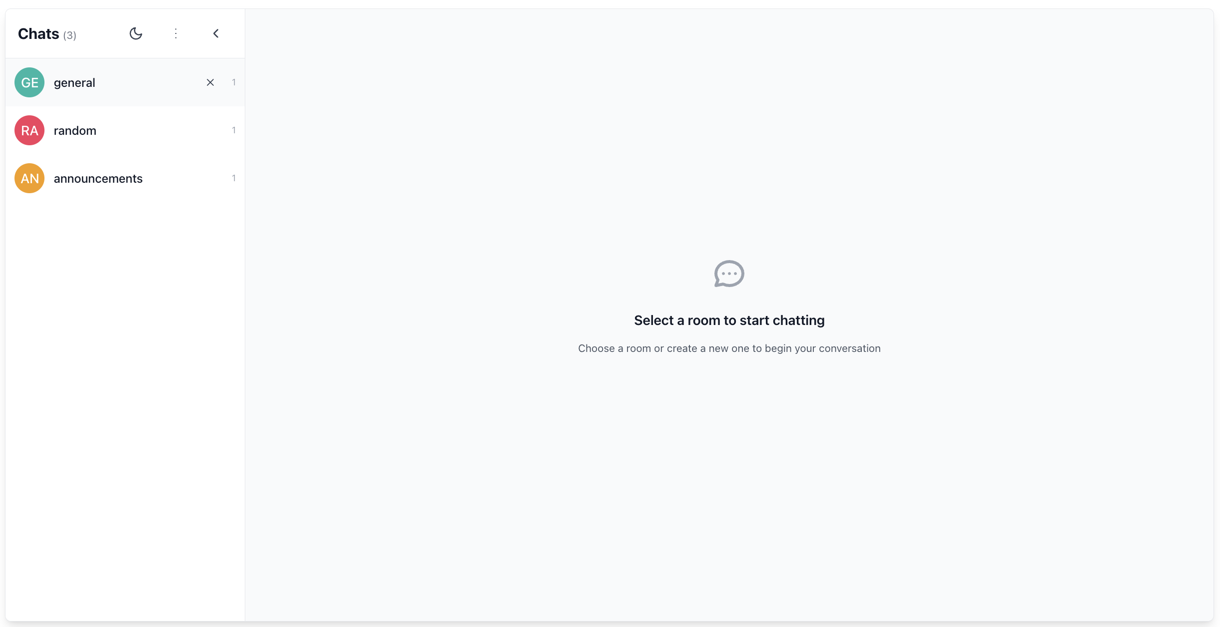
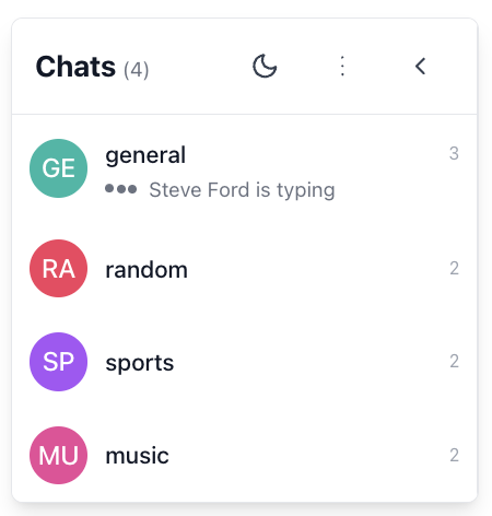
## Sidebar
The `Sidebar` component provides room navigation and management.
### Features
- Collapsible interface with avatar-only mode
- Room creation and management
- Theme toggle integration
- Active room highlighting
- Room count display
- Automatic room attachment/detachment
### Props
| Prop | Description |
|------|-------------|
| `roomNames` | Rooms to display |
| `activeRoomName` | Currently-active room (optional) |
| `defaultRoomOptions` | Ably options passed to each ChatRoomProvider |
| `addRoom` | Adds (or joins) a room |
| `setActiveRoom` | Sets the active room |
| `leaveRoom` | Leaves a room |
| `className` | Optional CSS class names for additional styling |
| `isCollapsed` | Whether the sidebar is in collapsed mode (avatar-only) |
| `onToggleCollapse` | Callback to toggle the collapsed state |
### Room Management
The Sidebar component handles room management through the following functions:
- **addRoom**: Adds a new room to the list or joins an existing room
- **setActiveRoom**: Sets the active room for display in the main content area
- **leaveRoom**: Removes a room from the list and handles cleanup
### Usage
#### React

```
import { Sidebar } from '@ably/chat-react-ui-kit';
import { RoomOptions } from '@ably/chat';
import { useState } from 'react';

const [rooms, setRooms] = useState(['general', 'random']);
const [activeRoom, setActiveRoom] = useState('general');
const [isSidebarCollapsed, setIsSidebarCollapsed] = useState(false);
const [roomOptions] = useState({ occupancy: { enableEvents: true } });

const addRoom = (name: string) => {
  console.log(`Adding room: ${name}`);
  setRooms(prev => prev.includes(name) ? prev : [...prev, name]);
};

const leaveRoom = (name: string) => {
  console.log(`Leaving room: ${name}`);
  setRooms(prev => prev.filter(n => n !== name));
  if (activeRoom === name) {
    setActiveRoom(rooms.length > 0 ? rooms[0] : undefined);
  }
};

const handleSetActiveRoom = (name?: string) => {
  console.log(`Setting active room to: ${name}`);
  setActiveRoom(name);
};

 setIsSidebarCollapsed(prev => !prev)}
/>
  ```
Rooms are automatically attached when the Sidebar is mounted, and detached when the component unmounts.
## ChatMessageList
The `ChatMessageList` component displays a list of chat messages with advanced scrolling functionality. It supports infinite scrolling, message history loading, and automatic scrolling to new messages.
### Features
- Message display with history loading and infinite scroll
- Automatic scrolling to new messages
- Loading indicators for history fetching
- Typing indicators integration
- Scroll position preservation when loading history
- Virtualized rendering for performance with large message lists
- Accessibility support with proper ARIA roles
### Props
| Prop | Description |
|------|-------------|
| `messages` | Array of Ably Chat Message objects to render |
| `onLoadMoreHistory` | Callback triggered when user scrolls near the top of the message list |
| `isLoading` | Whether a history loading operation is currently in progress |
| `hasMoreHistory` | Whether there are more historical messages available to load |
| `onMessageInView` | Callback triggered when the user scrolls to view a specific message |
| `onViewLatest` | Callback triggered when the user scrolls to the bottom of the message list |
| `onEdit` | Callback triggered when a user saves an edited message |
| `onDelete` | Callback triggered when a user confirms deletion of their message |
| `onReactionAdd` | Callback triggered when a user adds an emoji reaction to any message |
| `onReactionRemove` | Callback triggered when a user removes their emoji reaction from a message |
| `children` | Optional React elements to render after all messages (e.g., TypingIndicators) |
| `autoScroll` | Whether to automatically scroll to bottom when new messages arrive |
| `loadMoreThreshold` | Distance in pixels from the top edge that triggers onLoadMoreHistory callback |
| `enableTypingIndicators` | Whether to enable built-in typing indicators in the chat window |
### Scrolling Behavior
The ChatMessageList component implements sophisticated scrolling logic:
1. **Auto-scrolling**: When new messages arrive, the list automatically scrolls to the bottom if the user is already near the bottom. This prevents interrupting the reading experience when viewing older messages.
2. **Infinite scrolling**: When the user scrolls near the top of the list, the `onLoadMoreHistory` callback is triggered to load older messages.
3. **Scroll position preservation**: When older messages are loaded, the scroll position is preserved so the user doesn't lose their place.
### Usage
#### React

```
import { ChatMessageList } from '@ably/chat-react-ui-kit';
import { Message } from '@ably/chat';
import { useState } from 'react';

// Example with useState for messages
const [messages, setMessages] = useState([]);
const [isLoadingHistory, setIsLoadingHistory] = useState(false);
const [hasMoreMessages, setHasMoreMessages] = useState(true);

const fetchPreviousMessages = () => {
  console.log('Loading more message history');
  setIsLoadingHistory(true);
  // Fetch logic would go here
  setIsLoadingHistory(false);
};

const handleEditMessage = (message: Message, newText: string) => {
  console.log(`Editing message with serial: ${message.serial}, setting text to: ${newText}`);
};

const handleDeleteMessage = (message: Message) => {
  console.log(`Deleting message with serial: ${message.serial}`);
};

const handleAddReaction = (message: Message, emoji: string) => {
  console.log(`Adding reaction ${emoji} to message with serial: ${message.serial}`);
};

const handleRemoveReaction = (message: Message, emoji: string) => {
  console.log(`Removing reaction ${emoji} from message with serial: ${message.serial}`);
};


```
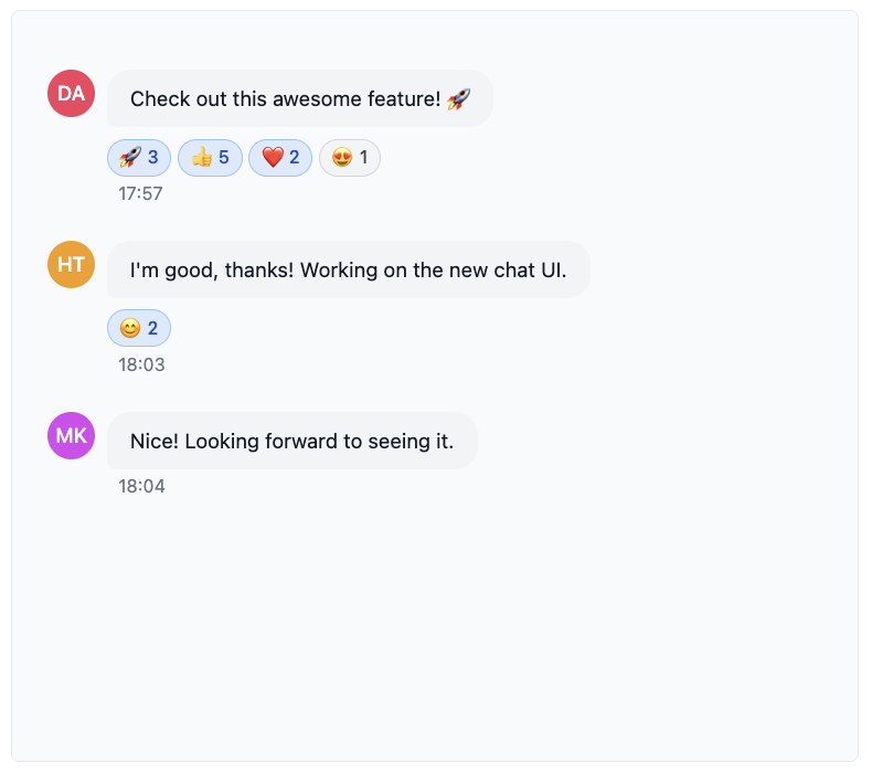
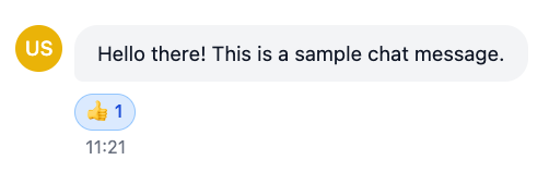
## ChatMessage
The `ChatMessage` component displays an individual chat message with interactive capabilities. It allows users to view, edit, delete, and react to messages.
### Features
- Message content display with sender avatar
- Edit/delete functionality for own messages with confirmation dialogs
- Emoji reactions system with picker and toggle functionality
- Status indicators (edited, deleted)
- Basic ARIA support (role, aria-label)
- Hover tooltips showing sender information
### Props
| Prop | Description |
|------|-------------|
| `message` | The Ably Chat message object used to display the message content |
| `onEdit` | Callback triggered when the user saves an edited message |
| `onDelete` | Callback triggered when the user confirms message deletion |
| `onReactionAdd` | Callback triggered when a user adds an emoji reaction to the message |
| `onReactionRemove` | Callback triggered when a user removes their emoji reaction from the message |
| `className` | Additional CSS class names to apply to the message container |
### Usage
#### React

```
import { ChatMessage } from '@ably/chat-react-ui-kit';
import { Message } from '@ably/chat';
import { useMessages } from '@ably/chat/react';

const { updateMessage, deleteMessage, sendReaction, deleteReaction } = useMessages();

 {
    console.log(`Editing message with serial: ${message.serial}, setting text to: ${newText}`);
    updateMessage(message.serial, { text: newText });
  }}
  onDelete={(message: Message) => {
    console.log(`Deleting message with serial: ${message.serial}`);
    deleteMessage(message.serial);
  }}
  onReactionAdd={(message: Message, emoji: string) => {
    console.log(`Adding reaction ${emoji} to message with serial: ${message.serial}`);
    sendReaction(message.serial, { name: emoji });
  }}
  onReactionRemove={(message: Message, emoji: string) => {
    console.log(`Removing reaction ${emoji} from message with serial: ${message.serial}`);
    deleteReaction(message.serial, { name: emoji });
  }}
/>
```
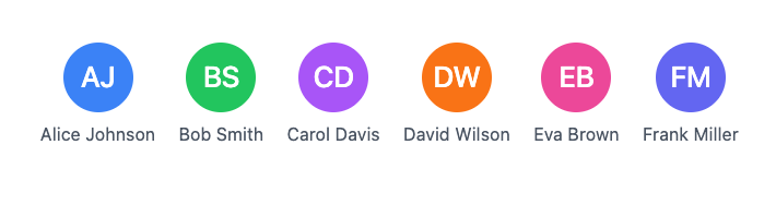
## Avatar
The `Avatar` component displays a user or room avatar with fallback to initials when no image is available.
### Features
- Displays user or room avatar image
- Generates initials from the `alt` text if no image is provided
- Customizable background color when no image is available
- Supports different sizes (small, medium, large, extra-large)
- Click handler for interaction
### Props
| Prop | Description |
|------|-------------|
| `src` | URL to the avatar image |
| `alt` | Alternative text for the avatar image, also used for generating initials if needed |
| `color` | Background color for the avatar when no image is provided (uses Tailwind CSS color classes) |
| `size` | Size of the avatar |
| `initials` | Custom initials to display when no image is available |
| `onClick` | Click handler for the avatar |
### Usage
#### React

```
import { Avatar } from '@ably/chat-react-ui-kit';

// Basic usage


// With fallback to initials


// With custom initials


// With click handler
 console.log('Avatar clicked')}
/>
```
### Integration with AvatarProvider
The Avatar component is designed to integrate with the `AvatarProvider` to display consistent avatars across your application, but it also works independently. The `AvatarProvider` can be used to manage avatar generation and caching for users and rooms.:
#### React

```
import { Avatar, useUserAvatar } from '@ably/chat-react-ui-kit';
const { userAvatar } = useUserAvatar({
    clientId: 'user-123',
    displayName: 'John Doe',
  });


```
## ParticipantList
The `ParticipantList` component displays a positioned modal showing all room participants.
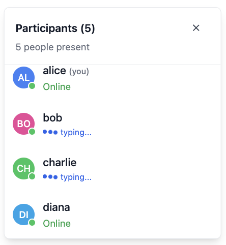
### Features
- Modal overlay with absolute positioning based on provided coordinates
- Participant list with avatars, names, and status indicators
- Smart sorting: current user appears first, followed by alphabetical order
- Typing indicators for active participants
- Participant count display in header
- Scrollable list with fixed maximum height for large participant counts
- Accessible modal dialog with proper ARIA attributes and focus management
### Props
| Prop | Description |
|------|-------------|
| `presenceData` | Array of Ably Chat presence members currently in the room |
| `currentClientId` | Client ID of the current Ably Connection for the room |
| `currentlyTyping` | Set of client IDs for users who are currently typing |
| `onToggle` | Callback function to toggle the list open/closed state |
| `position` | Absolute positioning coordinates for rendering the modal |
### Live Participant Tracking
The ParticipantList component can be used to show currently active participants in the room.
- Only shows users who are currently present in the room based on presence data
- Displays typing indicators for users who are currently typing
- Sorts the current user to the top of the list for easy identification
### Usage
#### React

```
import { ParticipantList } from '@ably/chat-react-ui-kit';
import { useChatClient, usePresence, useTyping } from '@ably/chat/react';
import { useState } from 'react';

// Integration with presence and typing hooks
const { presenceData } = usePresence();
const { currentlyTyping } = useTyping();
const { clientId } = useChatClient();
const [participantListOpen, setParticipantListOpen] = useState(false);

const toggleParticipantList = () => {
  console.log('Toggling participant list');
  setParticipantListOpen(prev => !prev);
};

{participantListOpen && (

)}
```