Have you ever wanted to see the work of your entire engineering organization in a visualization as it happens? In this article, I'll tell you how I used Github webhooks and Netlify serverless functions, along with a simple Svelte web app, to do just this in my new interactive visualizer tool.
Graphical visualizations are a fun way to see progress and to help your organizations to understand that, while tech work can sometimes seem invisible, the amount of effort involved in building software is a huge team endeavour!
In the early 2000s, a tool was built that could visualize your software version history, called Gource. It was built for CVS server, and later ported to work with Subversion, and later, finally git. Gource displays changes to a repository in an animated force tree diagram.
While Gource is an excellent and powerful tool, it only works locally, you have to install the software and run it. It parses historic commit log data, and generates a video file with the visualization using OpenGL. It doesn’t show data in realtime.
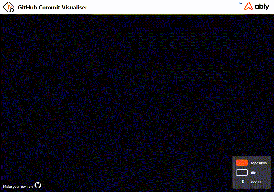
Taking inspiration from Gource, and with the advantage of the versatility of the web in 2022, I decided to build a modern visualization tool that works in a browser, in realtime. I wanted to depict code committed to a GitHub repository, or organization, as and when it is pushed or merged.
What you need to build a GitHub Visualizer:
- To send a message via WebSockets every time a commit gets pushed.
- A hosting platform to provide a payload URL
- To convert commit data into a file/folder hierarchy.
- A tool to display the commit data in a graphical form.
- Some code to stop the app from crashing if it runs for a long time or receives millions of messages.
GitHub webhooks to the rescue
GitHub offers webhooks which allow integrations to subscribe to events on github.com. Triggering an event by, for example, pushing a commit, will send an HTTP POST payload to a URL configured in your GitHub account. Webhooks can be installed for an entire organization, or per repository, which means that I can get commit data in realtime over HTTP. The next task is setting up a hosting provider to accept the webhook data and provide a callback.
How to host an app on Netlify
My GitHub Visualizer is hosted on Netlify. Netlify, and other cloud products, provide native support for serverless functions which let us run server-side code without having to manage a server ourselves. These serverless functions can be bundled with a web application, and are version controlled, built and deployed along with the rest of the app. By binding a serverless function to the GitHub Visualizer web application I could set up that function as the target of a GitHub webhook. Once the data arrives from GitHub I could publish it to the UI using Ably (see the code).
How to build the UI with Svelte
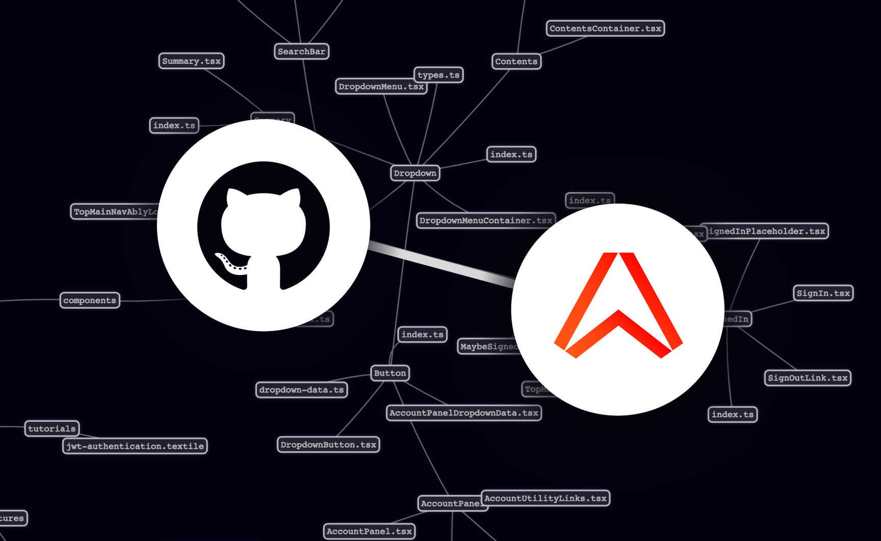
Building a single page web application that is reactive to incoming changes in data usually requires a framework. I chose to build the GitHub Visualizer with Svelte because of its simple approach to state management, readable syntax, small size and speed. The app consists of two Svelte components; one that subscribes to an Ably channel and keeps a GitHub commit history stored as a variable in the application, and another that can render the GitHub commit history as a "force directed graph".
When a message arrives from Ably, it is pushed to the history variable. Svelte has built in support for reactive variable assignment, which means that when a new value is assigned to that variable, the change will be immediately reflected in the UI. The next piece of the puzzle is visualizing the data.
How to make a force directed graph with VisJS
In order to display the GitHub data in a graph, I used VisJS, a library specially designed to handle large amounts of dynamic data. The graph is rendered in the browser in an HTML canvas, making it possible to show complex animations efficiently. The VisJS network component was exactly what I needed to display a complex diagram of “nodes” and their connecting lines, called “edges”. Nodes and edges are represented in a JS objects, for example:
var nodes = new vis.DataSet([
    {id: 1, label: 'Node 1'},
    {id: 2, label: 'Node 2'},
    {id: 3, label: 'Node 3'},
    {id: 4, label: 'Node 4'}
]);

var edges = new vis.DataSet([
    {from: 1, to: 3},
    {from: 1, to: 2},
    {from: 2, to: 4},
]);
Which means that the data that the app receives from the GitHub webhook needs to be converted into this format to be rendered.
How to convert GitHub webhooks data into JS objects
When a message arrives, the app will iterate over the commits in the message. It will store the file names that have been created, modified and deleted. If a file has been created then the app will split up each part of the file path and create a "node", and an "edge" connecting each to its parent part, eventually meeting at the root in the centre, which is the repository. Every node created has the full path to this point as an id, and each edge gets its id set to "{from}=>{to}" so that they can be found by file path in the future.
An example node might look like this:
{
    id: "docs/content/tutorials/github-vis.js",
    label: "github-vis.js"
    group: "docs",
    isFile: true,
    isRepository: false,
    isDirectory: false
}
And an example edge:
{
    from: "docs/content/tutorials"
    to: "docs/content/tutorials/github-vis.js"
    id: "docs/content/tutorials/=>docs/content/tutorials/github-vis.js"
}
For every created file new nodes are made and for any removed file nodes are deleted. Edges are generated for all of the created and modified nodes. The app also keeps a queue (a first in first out array) of every node that is created, and when it reaches a maximum number of nodes to display, it removes the oldest items from the top of the array. This will stop the app from consuming unbounded amounts of memory if an organization is very busy and millions of messages arrive. Nodes that are modified are removed from the queue and put back on the end of it, so that they aren't prematurely removed.
How to display the data
The data is now in a structure which represents the files present in the last N commits (however many you decide to store). The next job is to write some Svelte code that runs each time the data structure changes, which will do the following:
- Get the currently displayed nodes
- Find any nodes that are in the data structure that haven't yet been rendered
- Add those nodes to the force directed graph
- Add new edges to the graph to join the added nodes
- Remove any nodes that aren't in the data structure any more
VisJS has a reactive DataSet that can be used for this, the app just needs to to check the node IDs and add/remove nodes for it to trigger a re-render. Diffing the data set and data structure like this means that we don't continually recreate all the nodes on each commit. It also means that the physics applied to the graph by VisJS (the force which makes the nodes repel one another) is consistent and they won’t bounce around.
How to verify GitHub webhook data
There is one final gotcha in this project, it is necessary to ensure that folks can't just push data at our API and break the app. Luckily, GitHub supports signing webhooks with a HMAC signature. You make up a password and put it in the secret field in GitHub when you set up your webhooks. In the serverless function, we use the crypto module built into NodeJS to verify the HMAC and only forward it over Ably channels if the signatures match the shared secret.
Using this in your organization
- Clone the repository: https://github.com/ably-labs/github-commit-visualizer.git
- Deploy it to Netlify (or other hosting/serverless functions provider), remembering to set your Ably API key and GitHub webhooks secret as environment variables.
- Add the function URL as a GitHub hook from your org or repository to your deployed app.
4. Watch as your beautiful visualizations pop into existence!
Potential extensions
There are so many ways that this project could be expanded. There is a lot of data about the commit returned in the payload from GitHub, so the visual could be extended to show usernames next to file changes.
Other ideas
- Colour code the nodes by latest changes, make the older updates start to fade as newer ones come in
- Make nodes link to their respective file in GitHub on click
- Add a rewind option, so that you can look back in time
- Add some UI to pick a maximum number of nodes shown, for those on smaller screens.
The code for this project is open source and available on GitHub, in our Ably-Labs organisation. Please take it and make it your own. I am very open to PRs and do let me know if you find any issues. I hope you enjoy visualizing your own projects!